Design · Marketing · Content · Consulting

Hello, I’m Christie—glad you’re here.

Design with substance.
Stories with staying power.

Design has taken me on a remarkable journey of shaping brands, building strategies, and collaborating with talented people. Along the way, I’ve combined my experience in design, marketing, and content strategy with a love of learning and connecting with others. I’m excited to keep growing and put my creativity to work on projects and causes I care about.

↓
Pittsburgh, PA · Open to meaningful opportunities & collaborations

Selected work · 01—08

Built thoughtfully.
Made to perform.

Eight focused stories showing how strategy becomes clear, distinctive creative—and how the idea holds together through every production detail.

DeLallo — Olive Oil Rebranding + Refresh01

DeLallo

Olive Oil Rebranding + Refresh

Packaging Rebrand · Portfolio Architecture
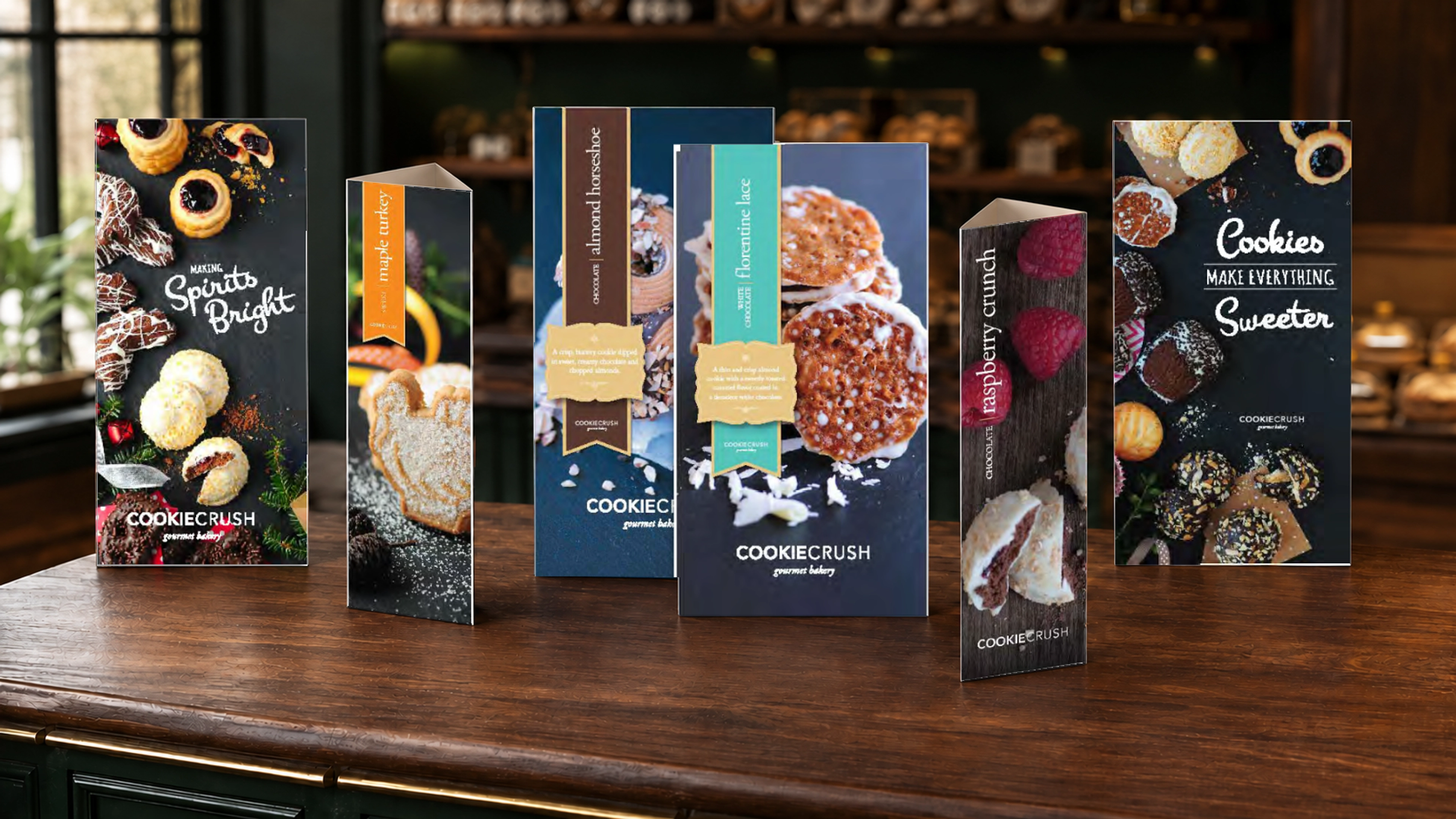
Cookie Crush — Seasonal retail storytelling made irresistible02

Cookie Crush

Seasonal retail storytelling made irresistible

Retail Campaign & Point of Sale
DeLallo — Italian snacking, translated for shelf03

DeLallo

Italian snacking, translated for shelf

Packaging System & Art Direction
DeLallo — Big flavor. Clear storytelling.04

DeLallo

Big flavor. Clear storytelling.

Trade Show & Grocery Signage
DeLallo — Catalogs for gathering & giving05

DeLallo

Catalogs for gathering & giving

Catalog Design · Editorial Layout
DeLallo — A fresh look for a familiar favorite06

DeLallo

A fresh look for a familiar favorite

Sales Brochure · Packaging Launch
DeLallo — Small jars. A clear family resemblance.07

DeLallo

Small jars. A clear family resemblance.

Packaging Design · Vendor Management
Point Park University — The Point Alumni Magazine08

Point Park University

The Point Alumni Magazine

Editorial Design · Art Direction · Print Production

20+ years shaping brands

Packaging · Retail · Content strategy · Production

Concept to shelf

Case study · 01

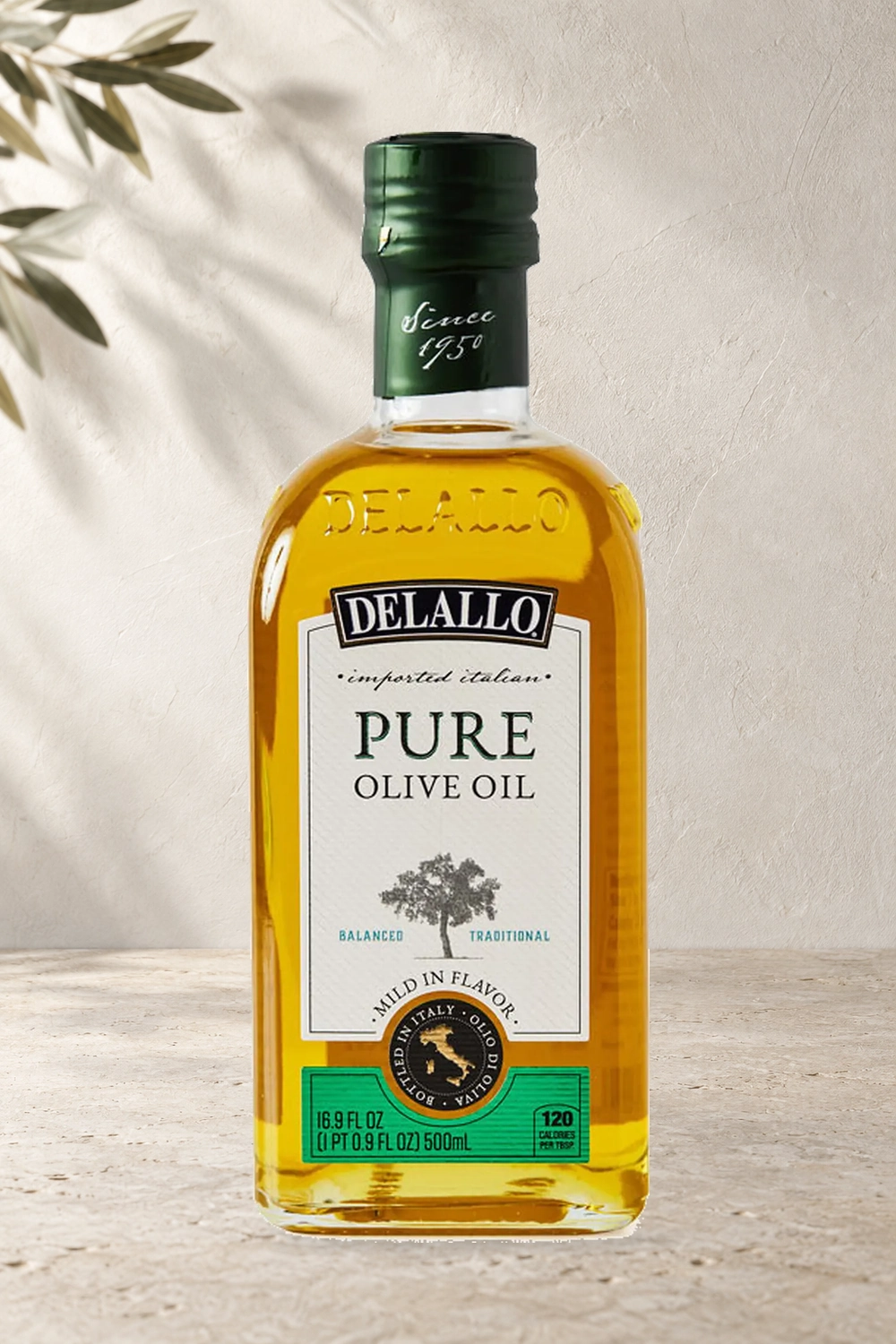
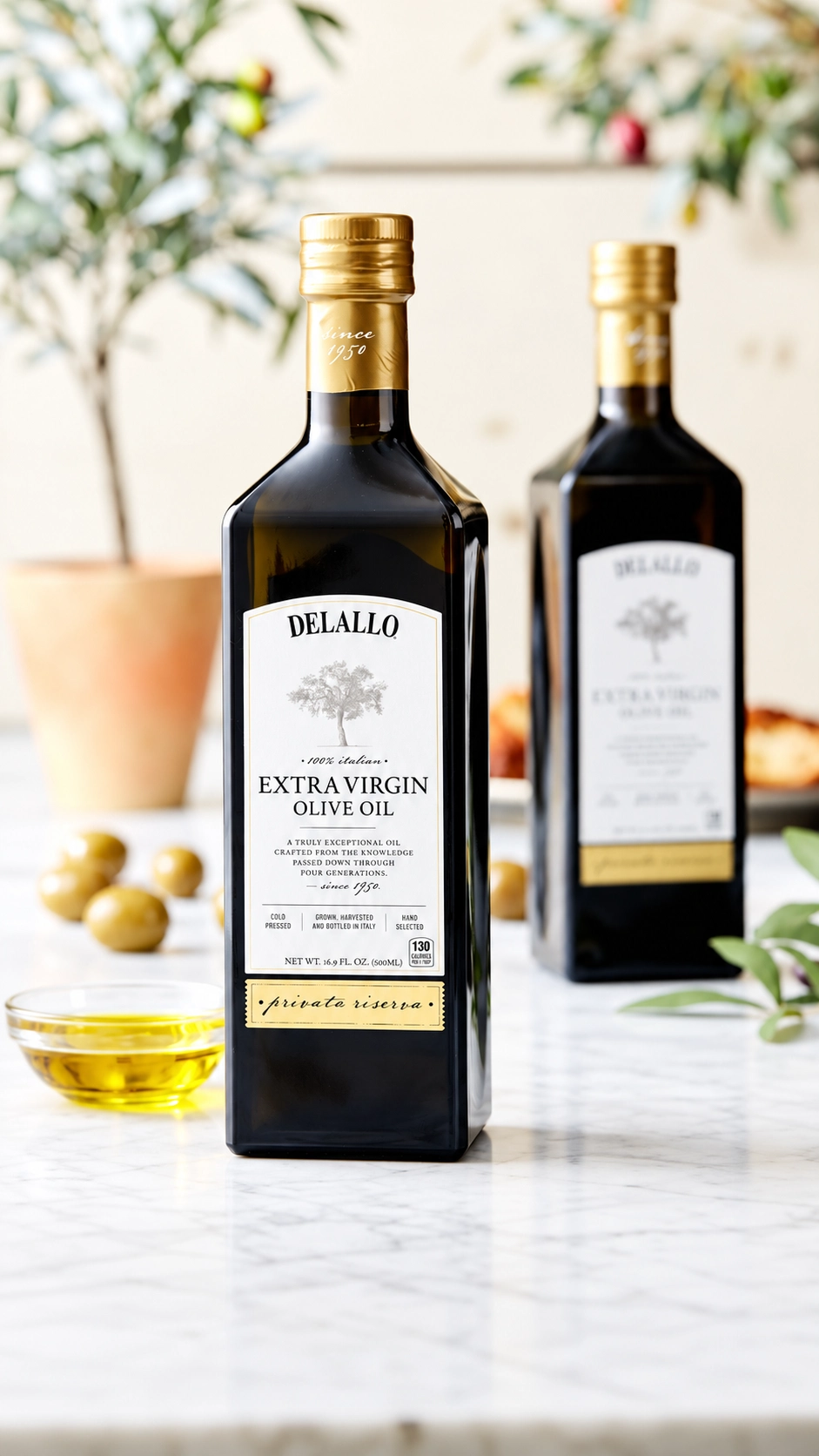
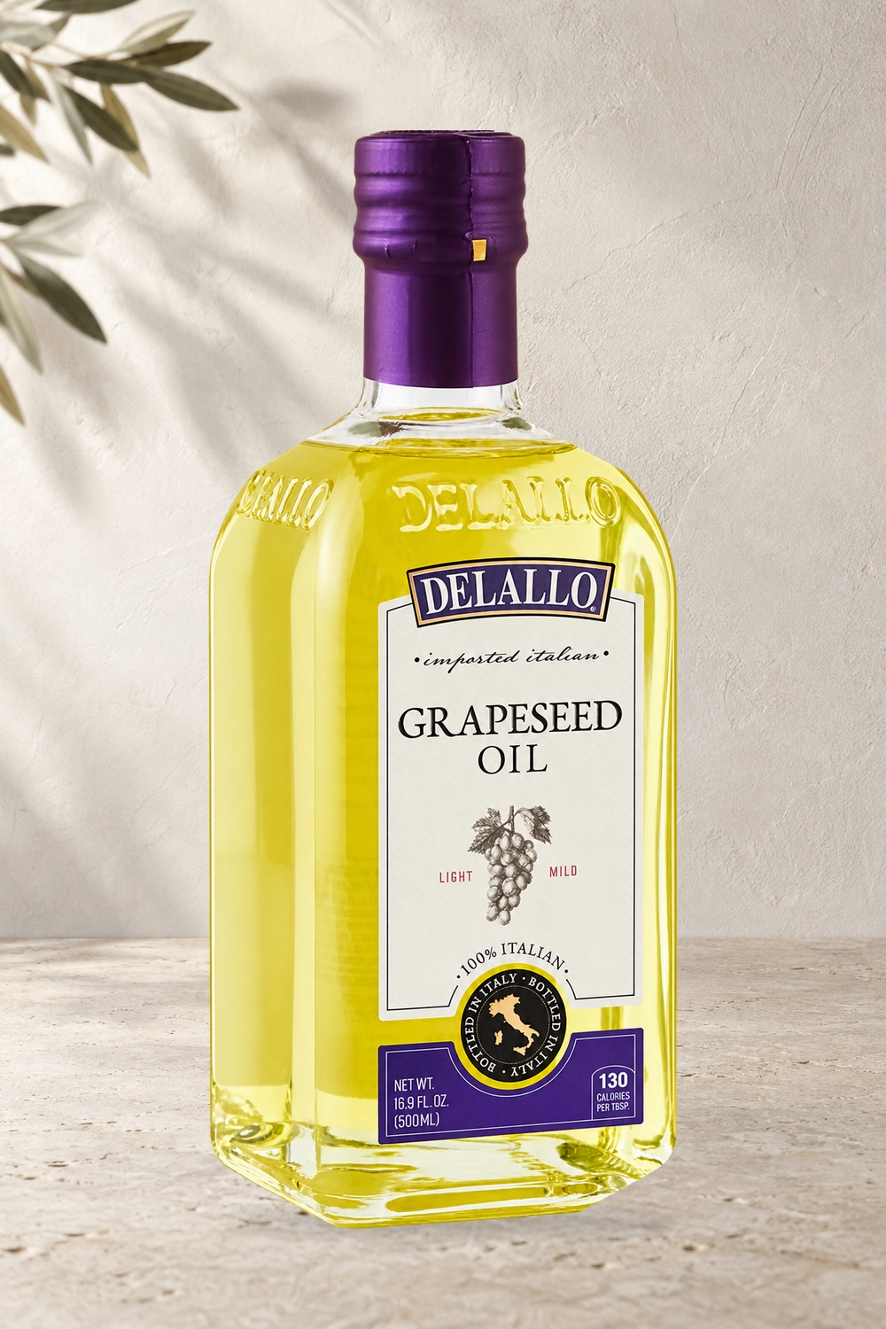
DeLallo

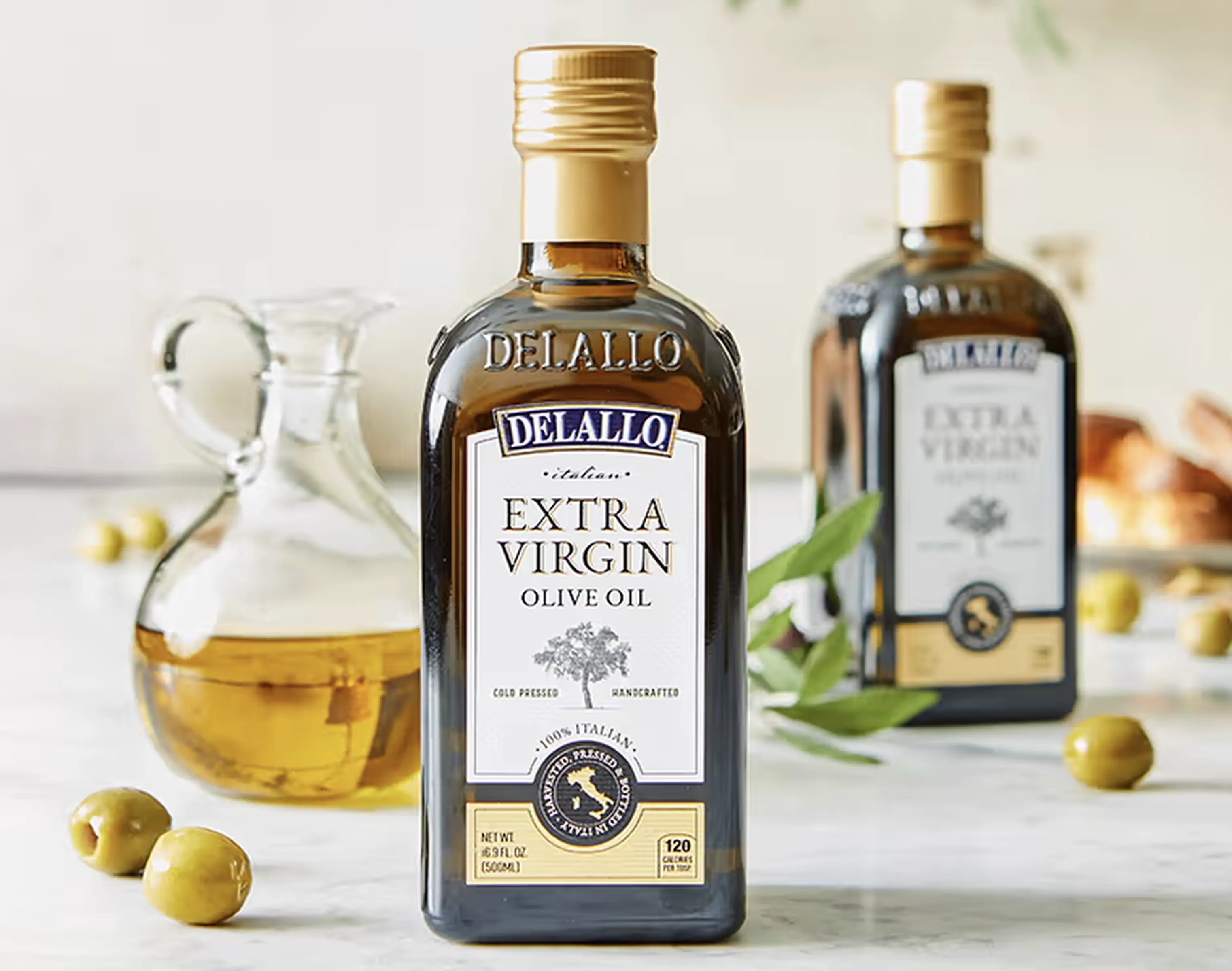
Elevating a heritage olive oil line for premium shelf impact.

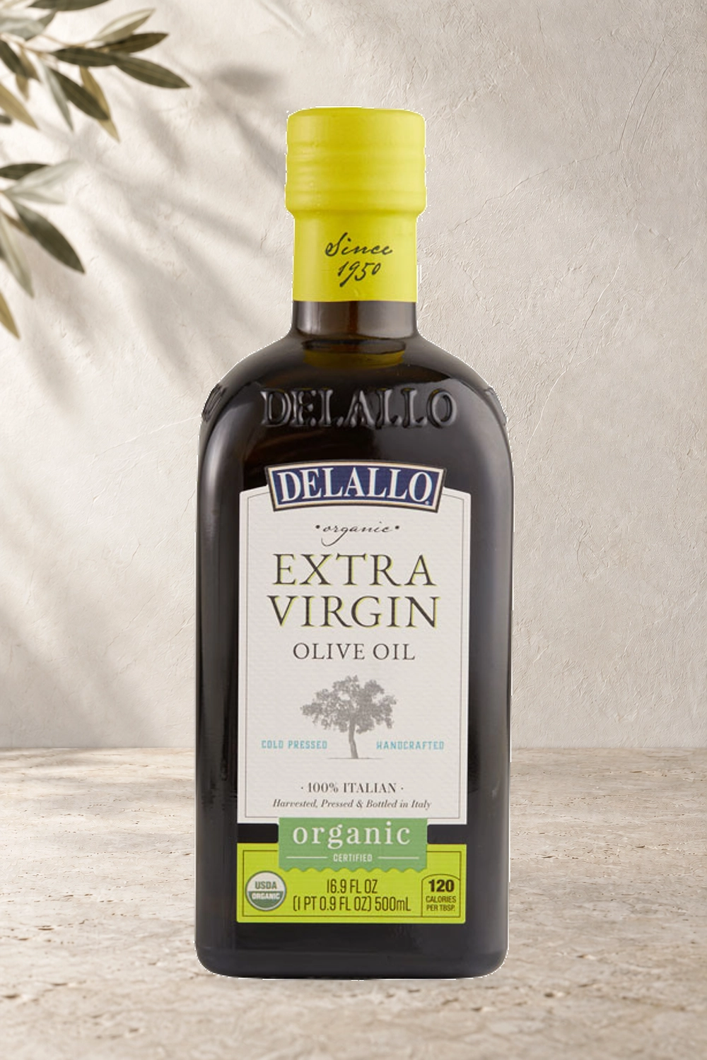
A portfolio-wide rebrand and packaging refresh designed to create a higher-quality shelf presence, unify the product family, and make core varieties and premium tiers easier to recognize.
Packaging RebrandPortfolio ArchitectureFDA Compliance
DeLallo Extra Virgin Olive Oil refreshed packaging in a premium kitchen setting
Front label
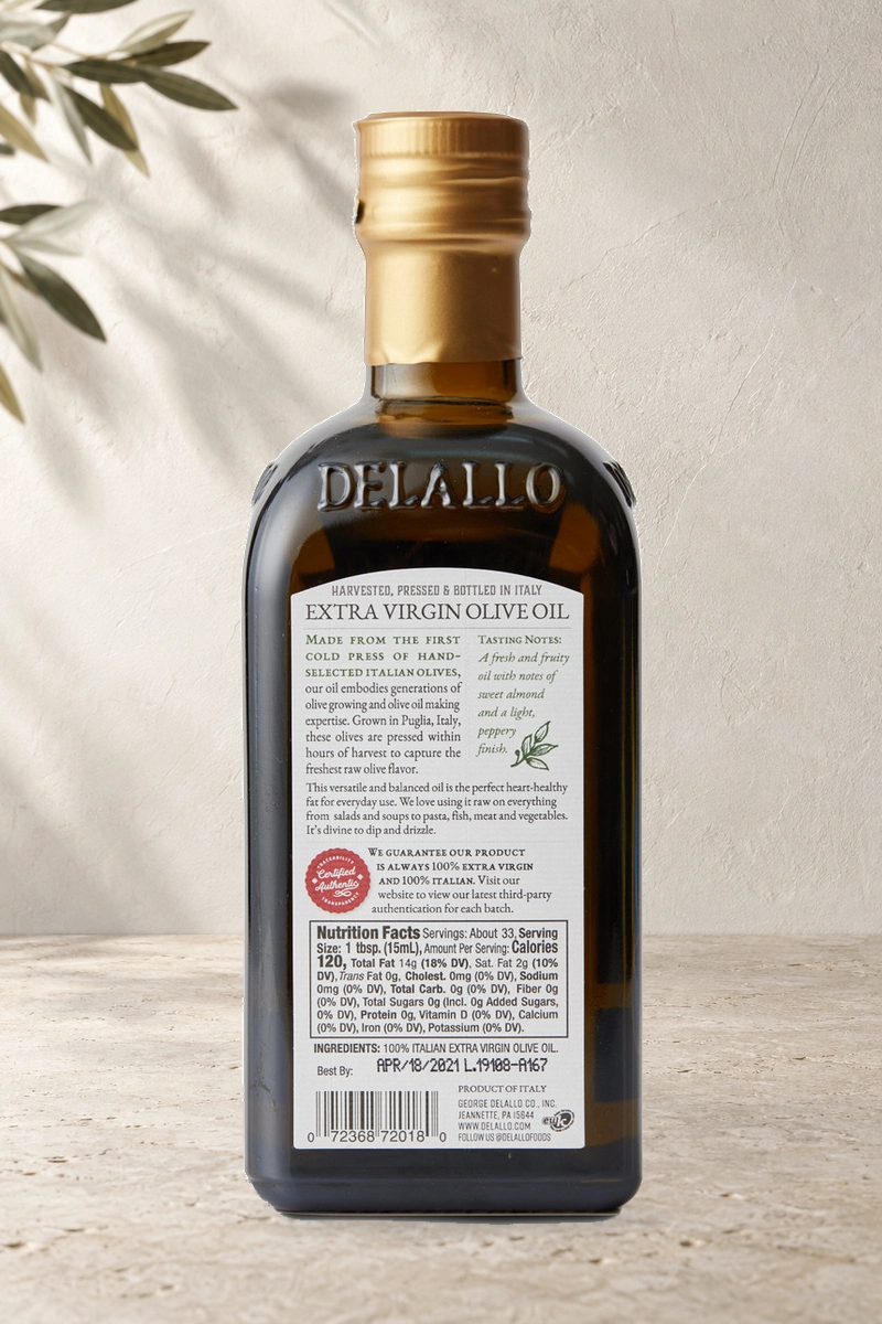
Original DeLallo Extra Virgin Olive Oil back label, showing product story and nutrition information on a light limestone surface
Back label

01 · Challenge

DeLallo’s high-quality olive oils needed a shelf presence that reflected the quality of the product. The line also needed a stronger shared architecture—one that could bring consistency across varieties while clearly distinguishing everyday, organic, specialty, and premium offerings.

02 · Solution

Refined the packaging system with cleaner typography, clearer label hierarchy, and consistent cues across varieties and tiers. I led the review and approval process with key executives, guiding the work from design through production while coordinating vendors and ensuring FDA label requirements were met.

03 · Outcome

The refresh created a more premium, cohesive product family with stronger shelf impact and clearer navigation across the line. The new architecture was successfully extended across core, organic, specialty, and premium varieties—strengthening portfolio consistency and making the line easier to navigate at shelf.

Contribution

Packaging and label designBrand architecture and typographyDomestic & international production and vendor managementReview and approval processFDA label requirements and approvalProject management
Back to selected work ↑

Case study · 03

DeLallo

Italian snacking, translated for shelf.

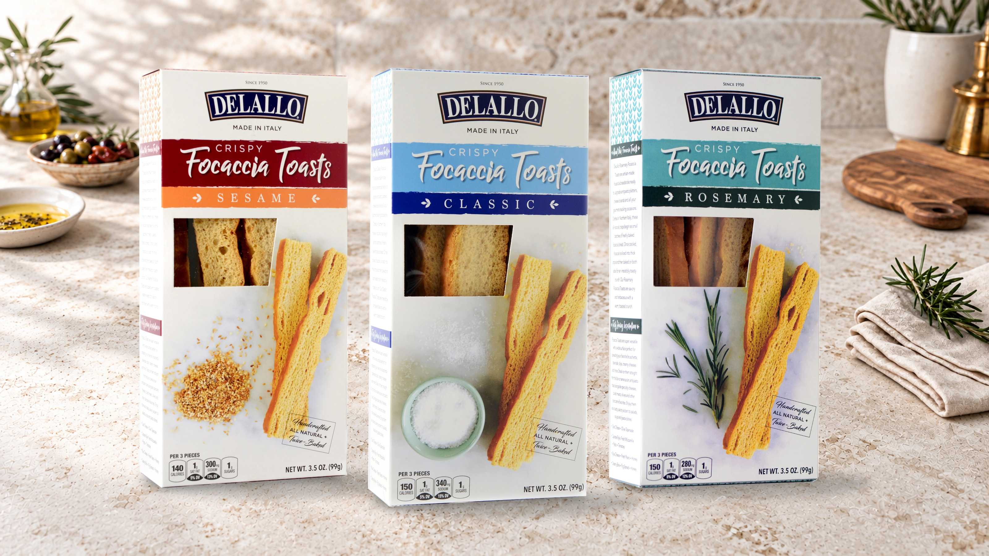
A coordinated packaging family for DeLallo Crispy Focaccia Toasts that balances Italian heritage, clear flavor navigation, and craveable product storytelling at a glance.

Packaging DesignBrand SystemFood Photography
Original DeLallo Sesame, Classic, and Rosemary Crispy Focaccia Toasts packages photographed together in an Italian tabletop setting

01 · Challenge

Unify three flavors within one recognizable family while helping shoppers quickly understand the product, its premium Italian positioning, and the distinctions between each variety.

02 · Solution

Created a clean architecture anchored by the DeLallo mark, expressive product naming, flavor-specific color bands, ingredient cues, and a generous window that makes the focaccia itself part of the design.

03 · Outcome

A confident shelf presence that communicates quality and variety quickly, gives each flavor its own identity, and keeps the complete line unmistakably DeLallo.

Contribution

Packaging conceptVisual systemTypographyProduction artworkProject management
Back to selected work ↑

Case study · 04

DeLallo

Big flavor. Clear storytelling.

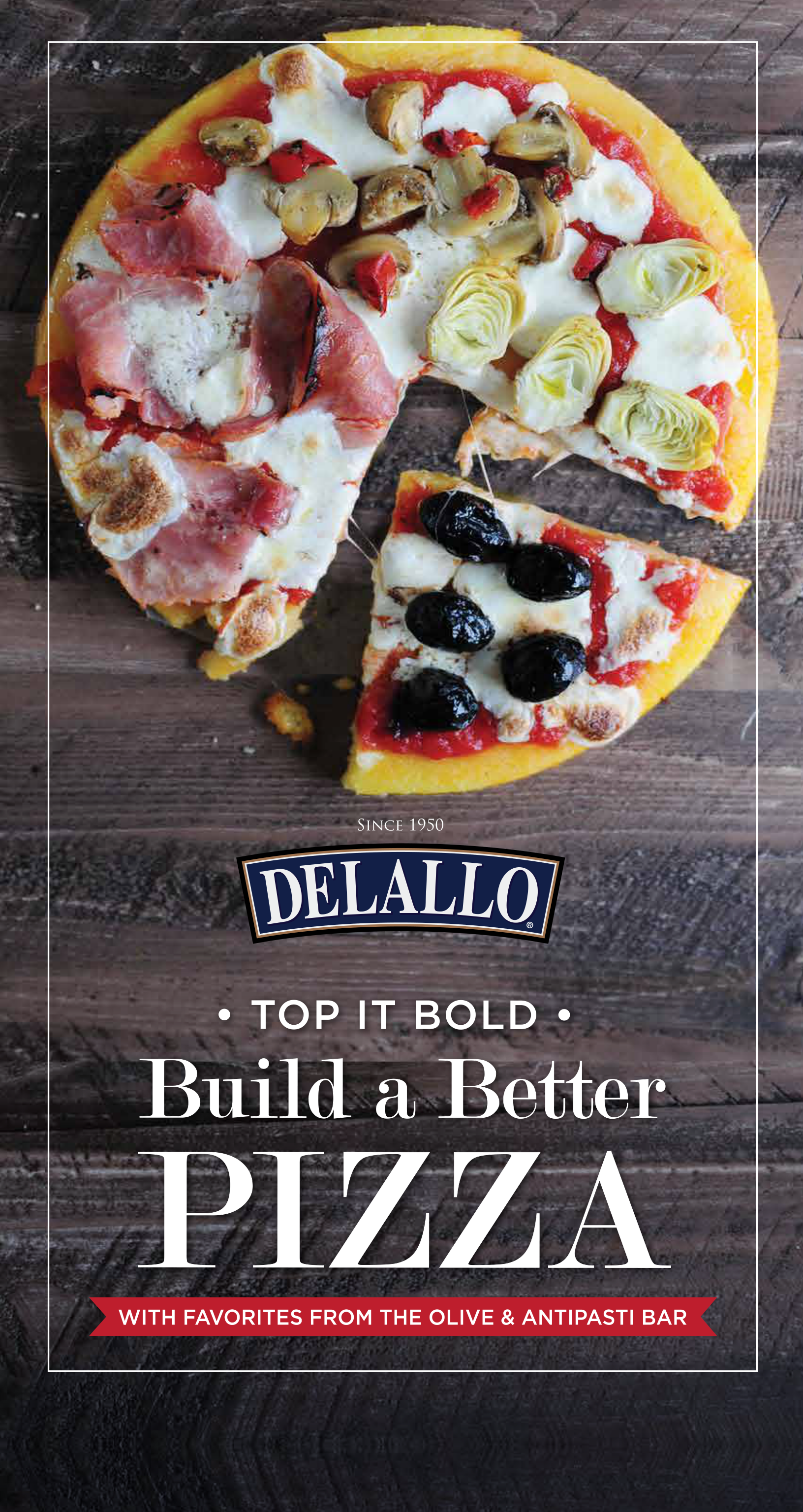
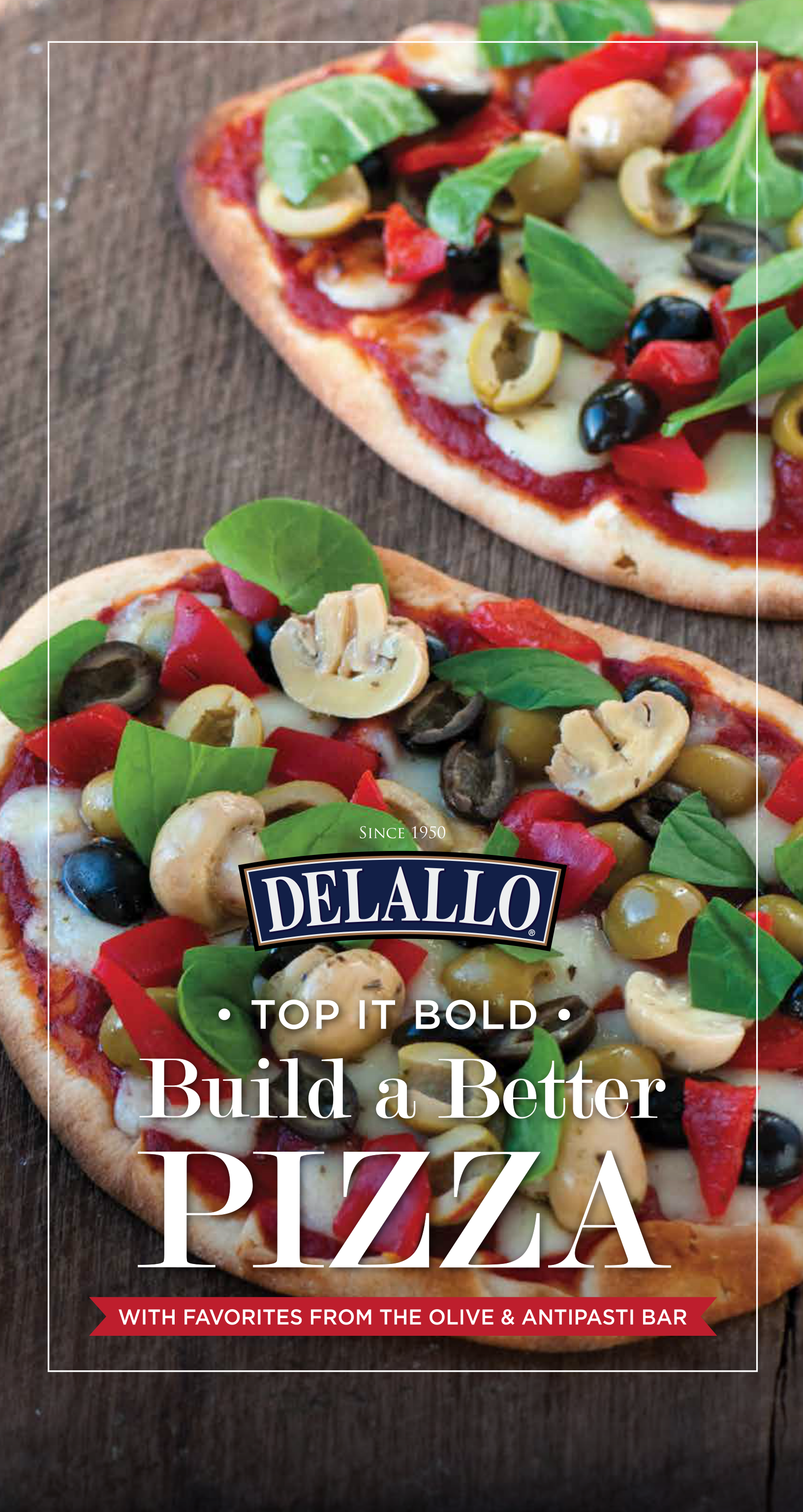
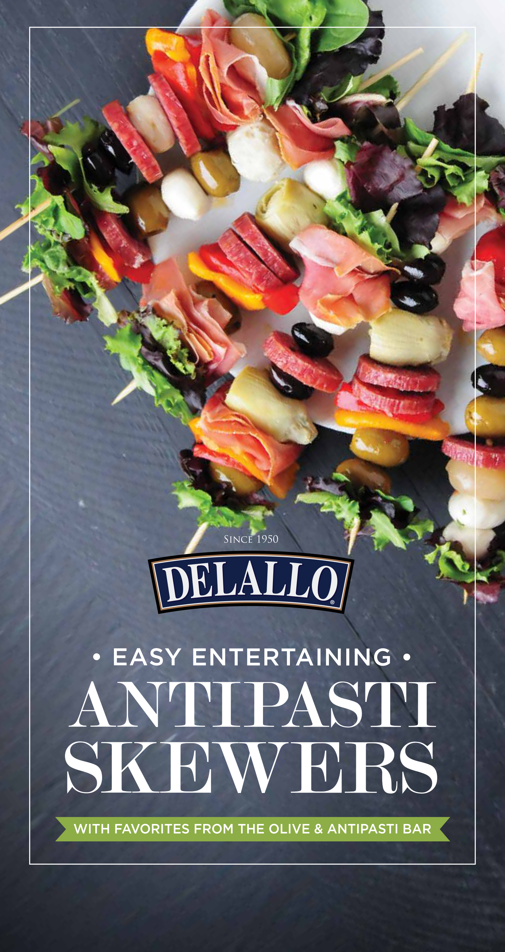
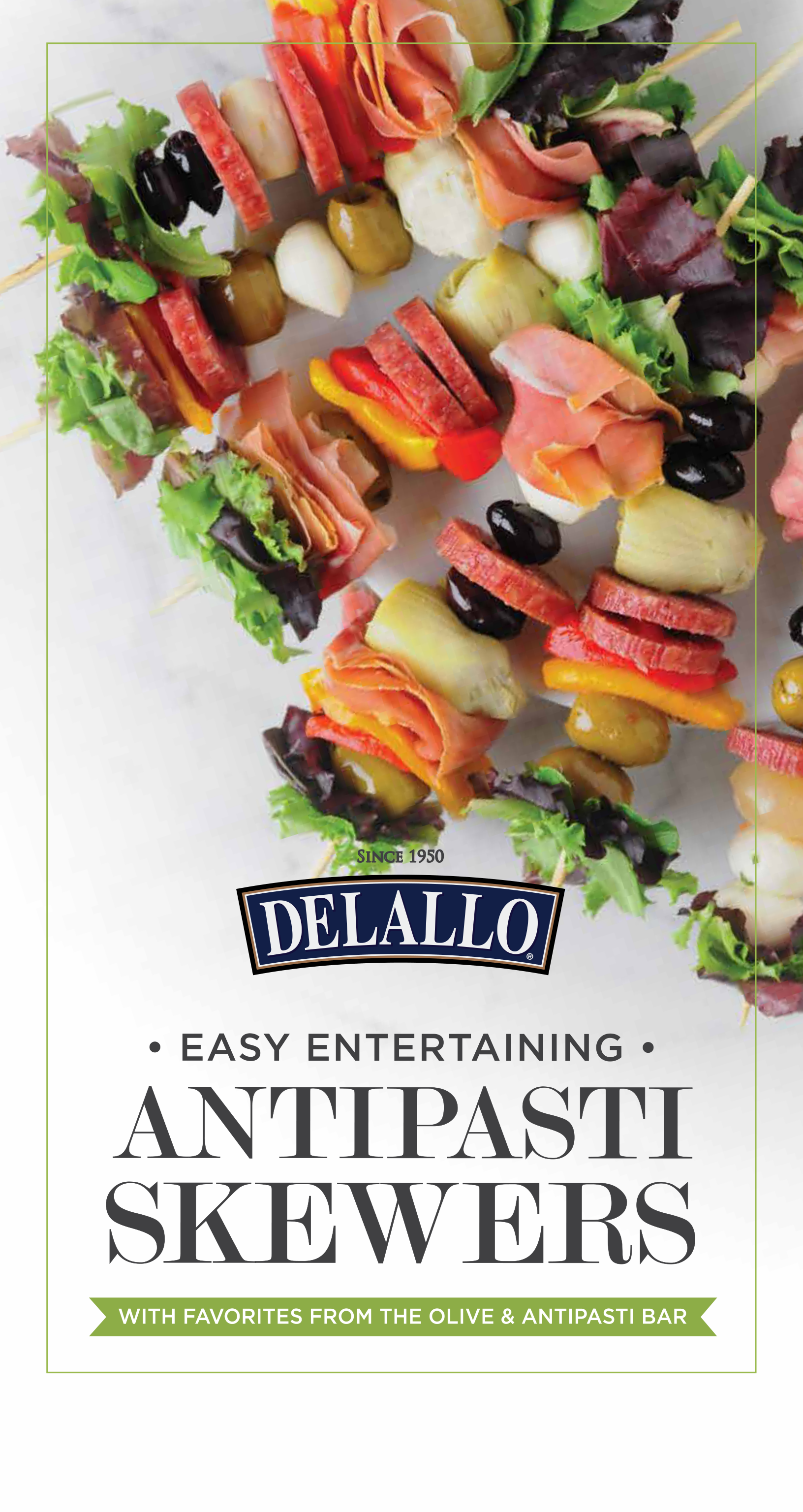
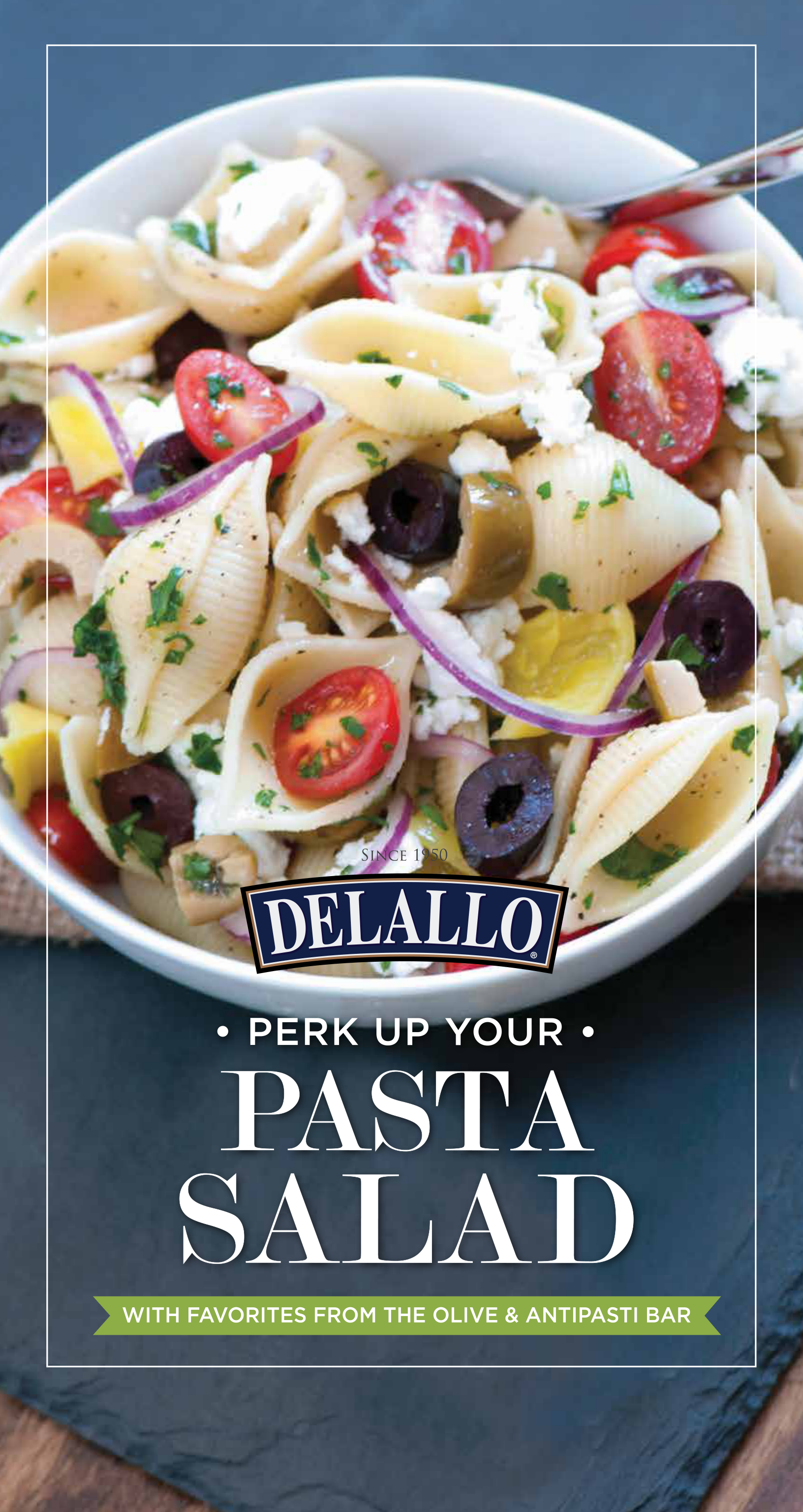
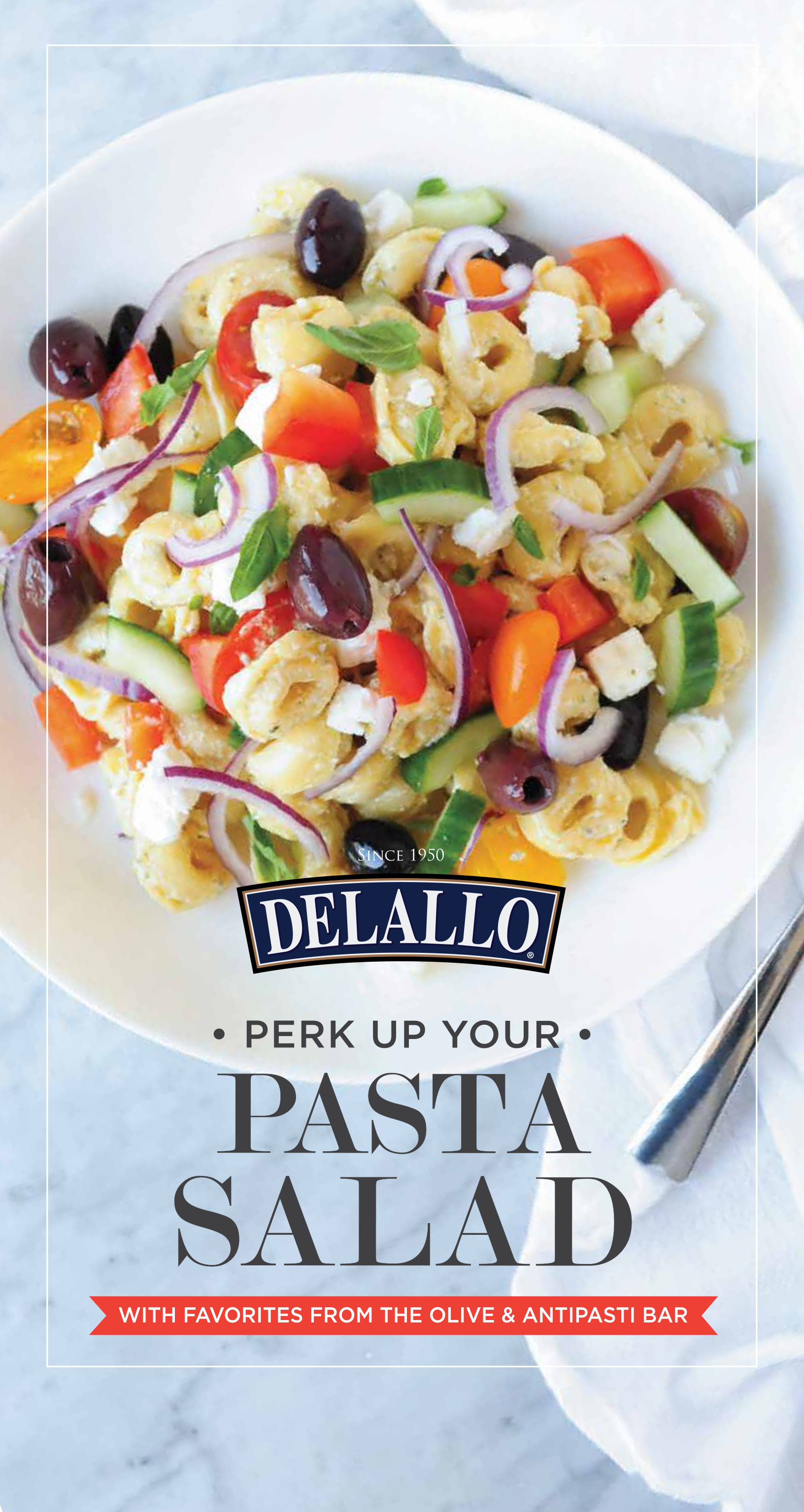
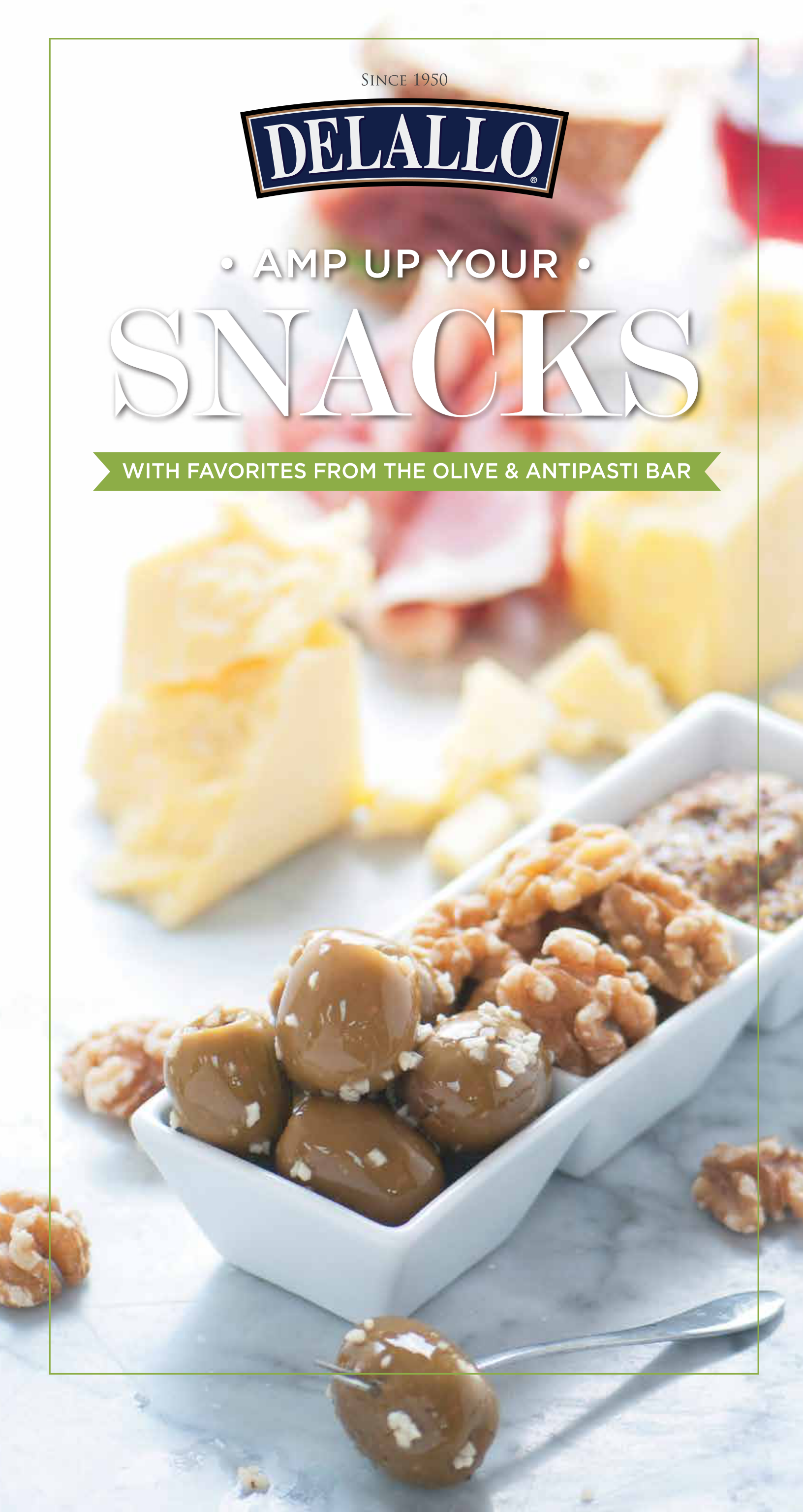
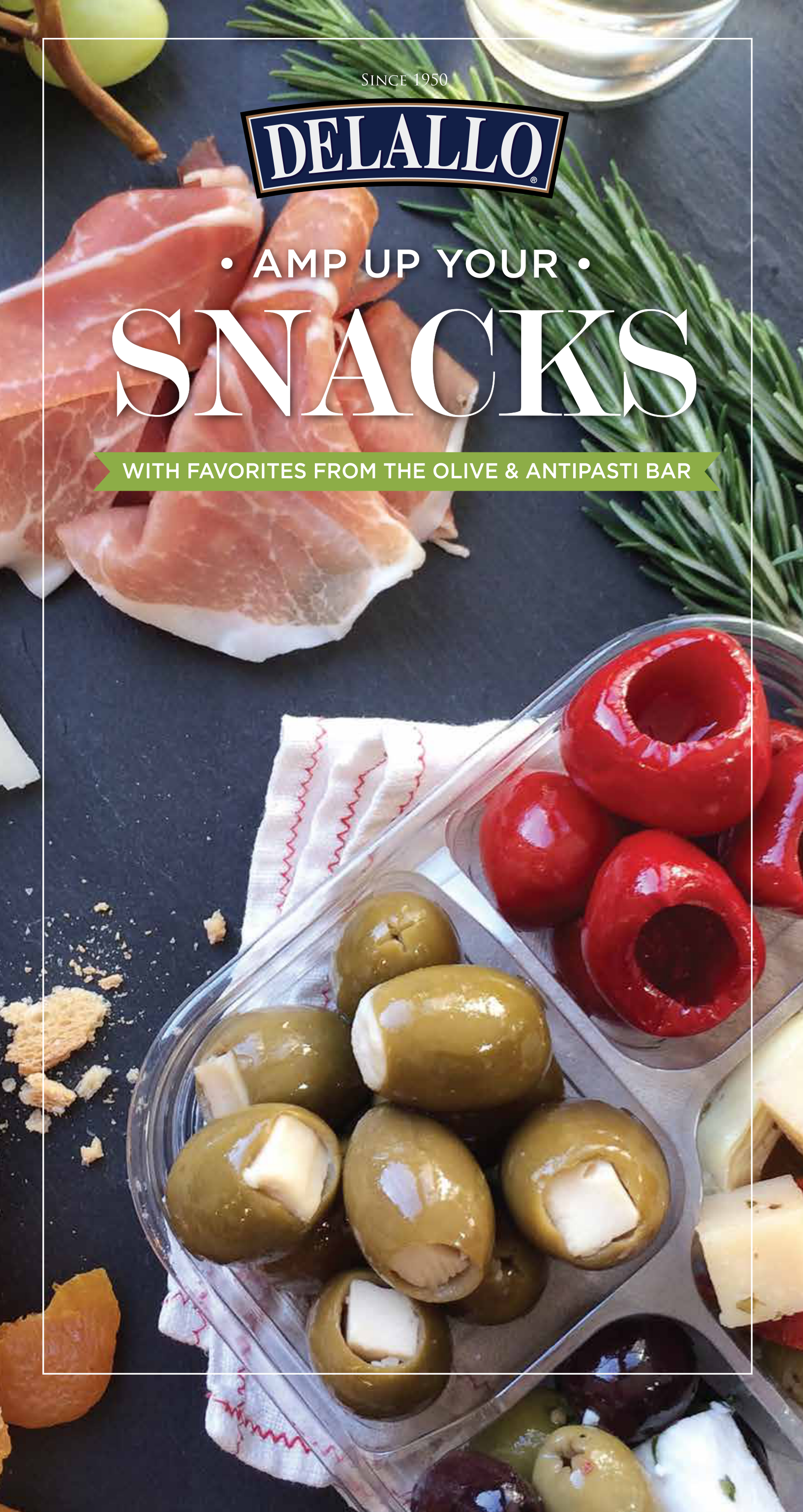
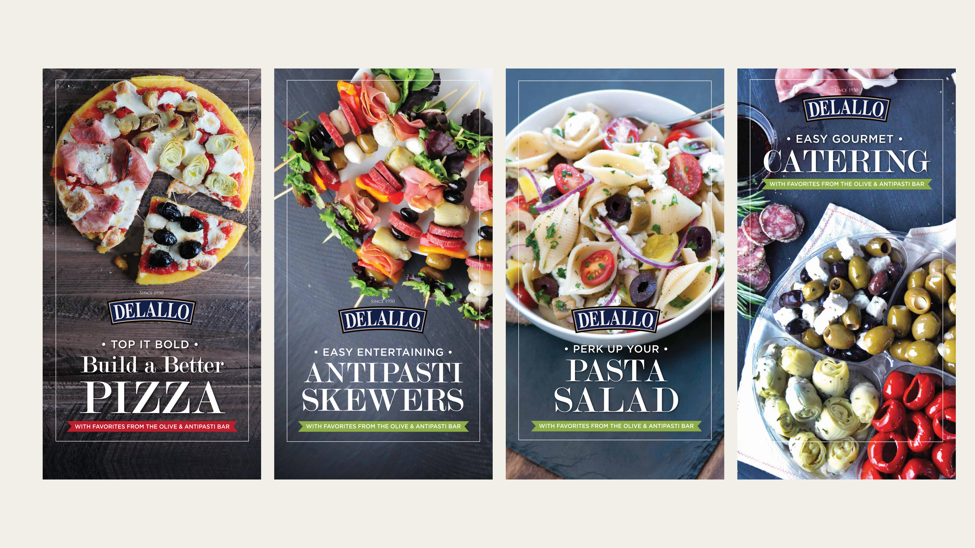
Double-sided signage for trade shows and grocery stores, promoting Italian dishes made with fresh ingredients. Food photography takes center stage, turning pizza, antipasti, salads, and more into inviting ideas for meals and entertaining.

Trade Show & Grocery SignageFood StorytellingDouble-Sided Design
Four original DeLallo double-sided signage designs promoting pizza, antipasti skewers, pasta salad, and catering

01 · Challenge

Create signage that could work in both a busy trade show and an in-store grocery setting. Each double-sided piece needed to make the dishes and ingredients appealing at a glance while keeping the collection clearly connected to DeLallo.

02 · Solution

Made food photography the star of the show, supported by simple headlines, clear typography, and the DeLallo mark. A consistent layout lets fresh ingredients and Italian dishes lead the story, with contrasting surfaces and accent colors bringing variety across the double-sided signs.

03 · Outcome

A cohesive signage collection that brings Italian food inspiration to trade shows and grocery stores. Across 18 designs, the signs highlight fresh ingredients and serving ideas, helping shoppers and visitors picture what they could make, share, and enjoy.

Contribution

Signage designTypography and layoutVisual consistencyProduction artworkProject management
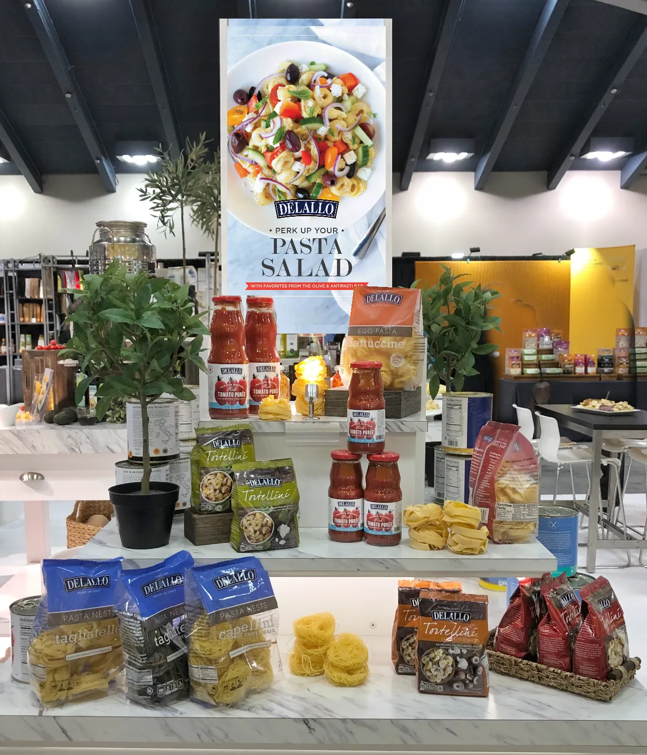
In the field

Bringing the food story into focus.

Double-sided signage brings fresh Italian food inspiration into the product display.

DeLallo product display with the original white pasta salad sign, shown in an edited placement photograph
Back to selected work ↑

Case study · 05

DeLallo

Designed for gathering. Made for giving.

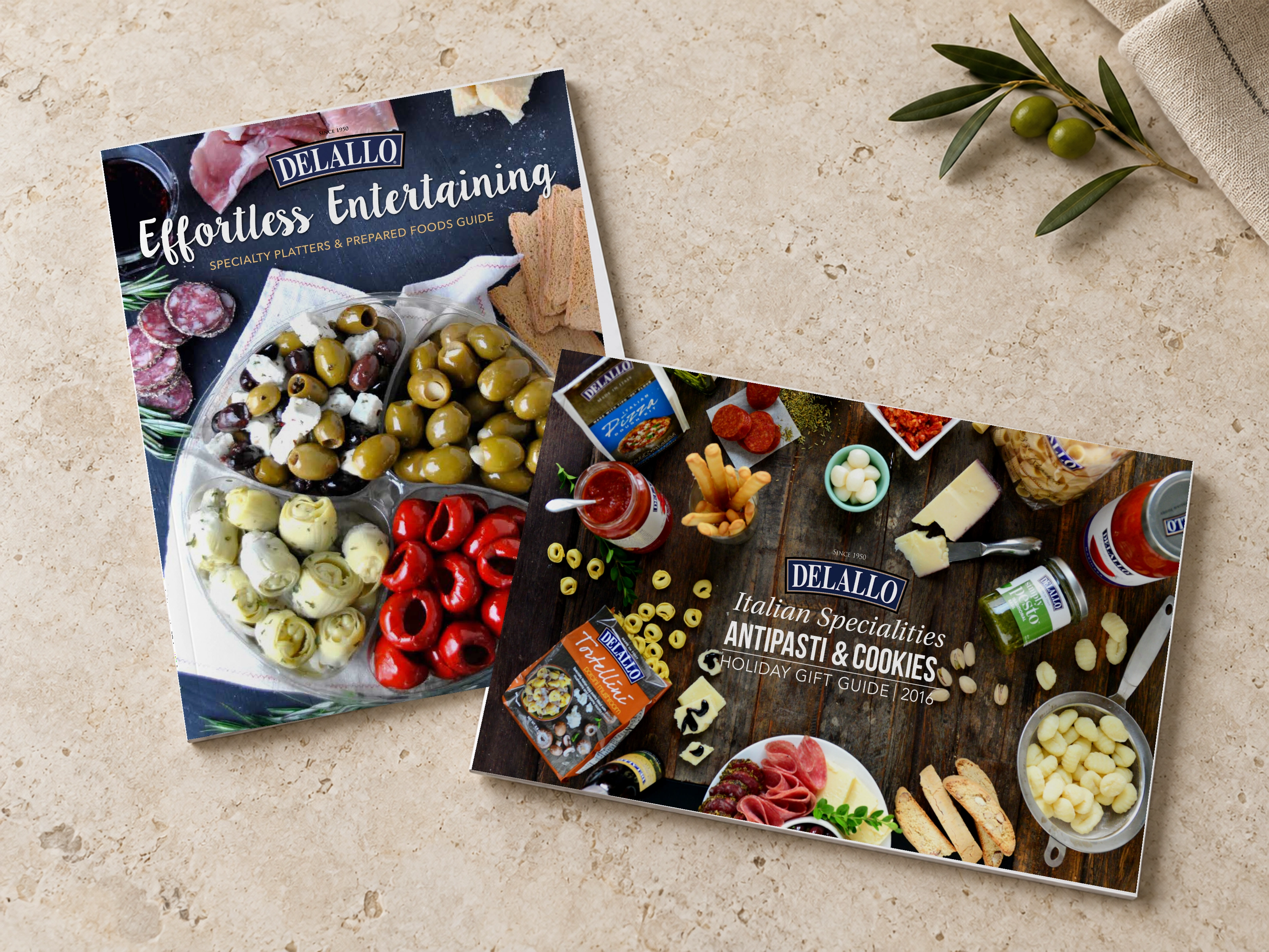
Two distinct catalogs, one unmistakable Italian food story. A catering brochure brings prepared foods and specialty platters into focus, while a holiday gift guide presents an assortment made for sharing.

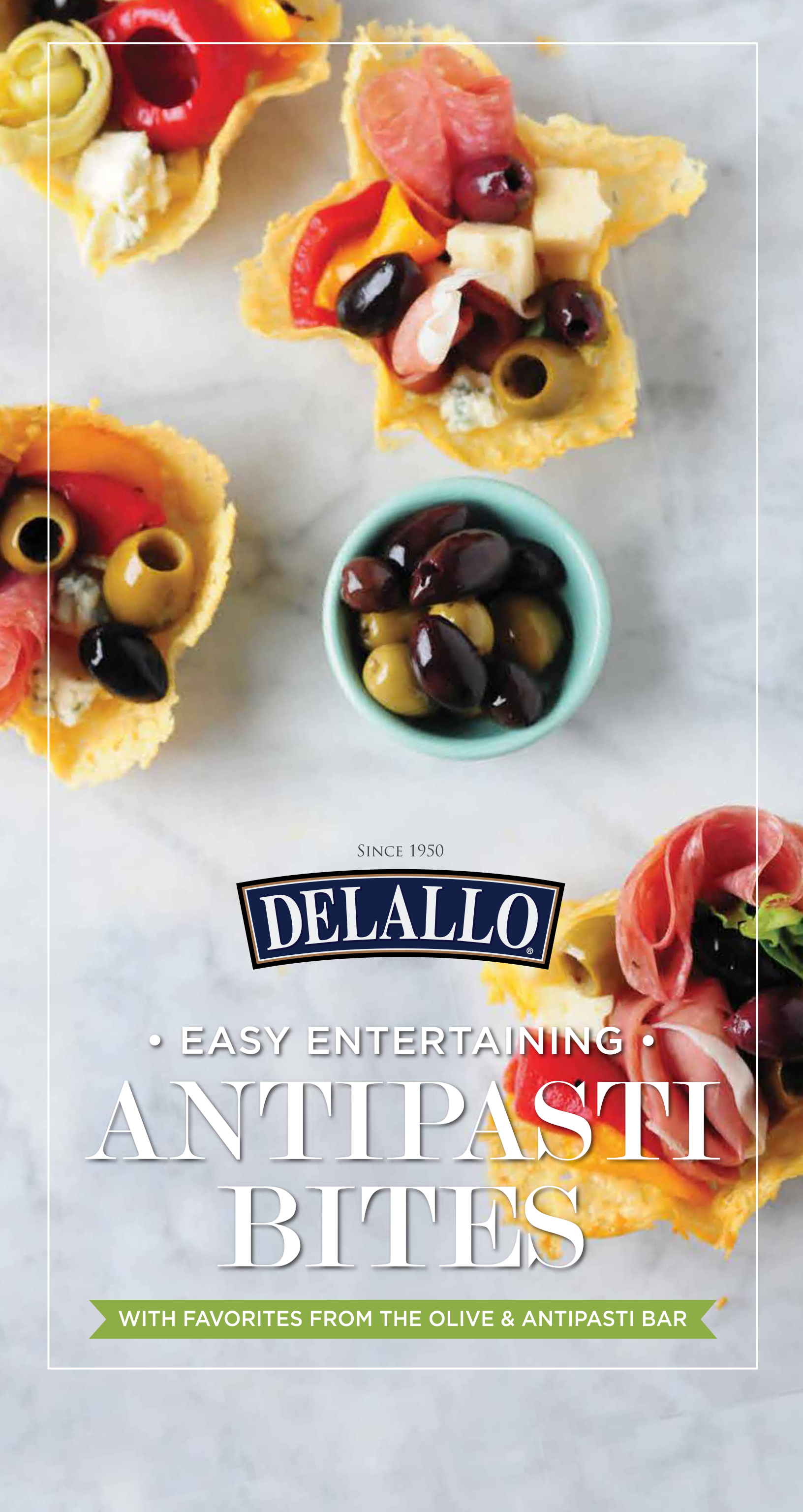
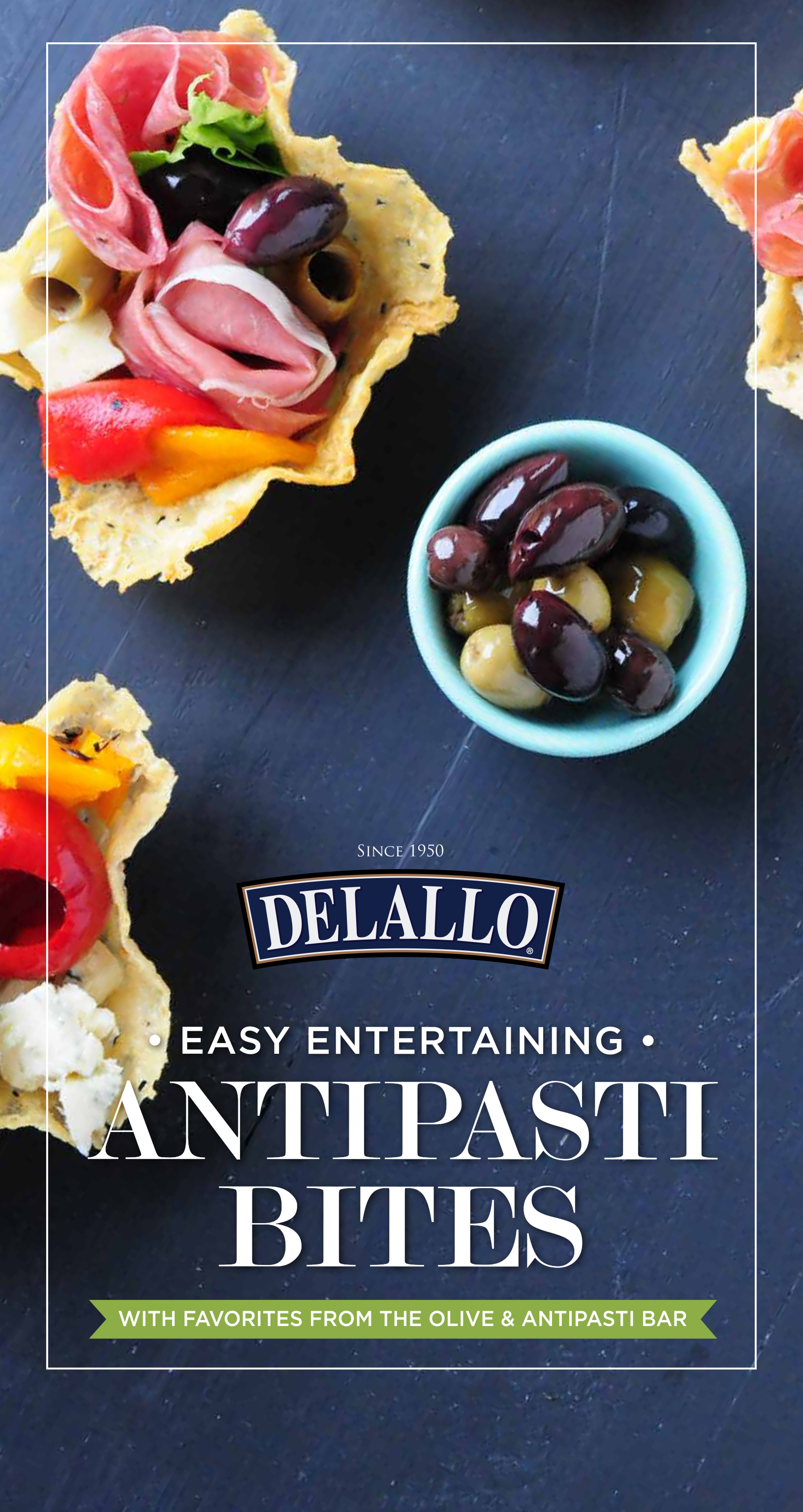
Catalog DesignEditorial LayoutProduct Storytelling

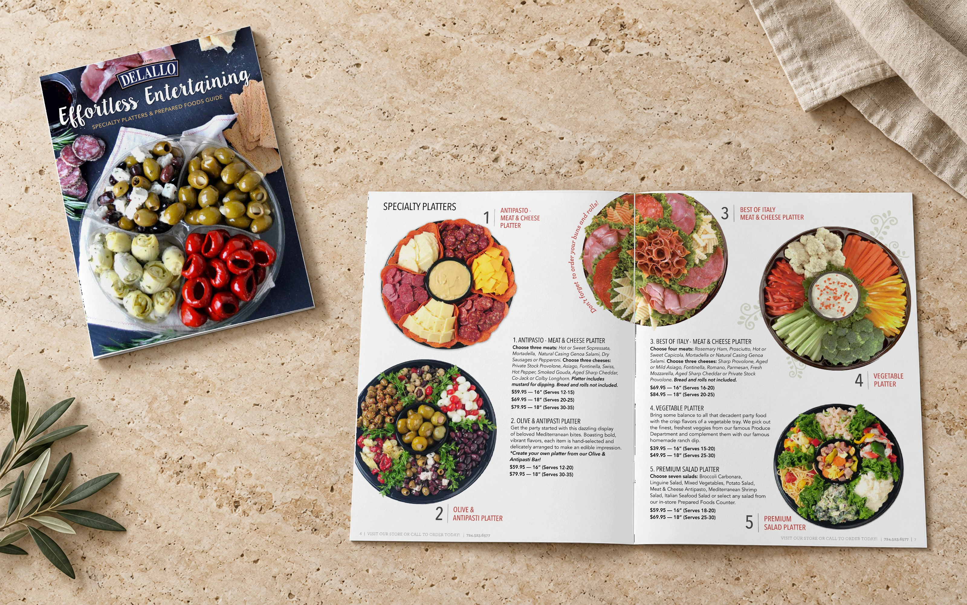
01 · Catering brochure

Effortless entertaining starts here.

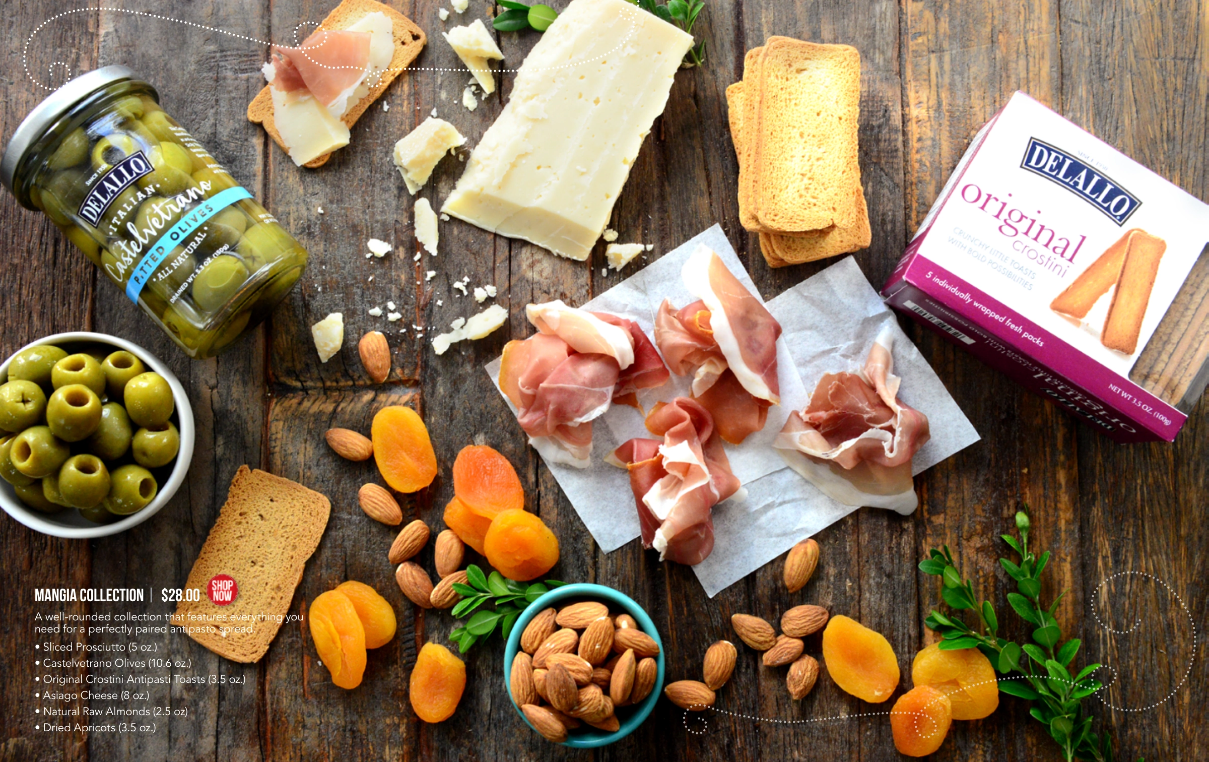
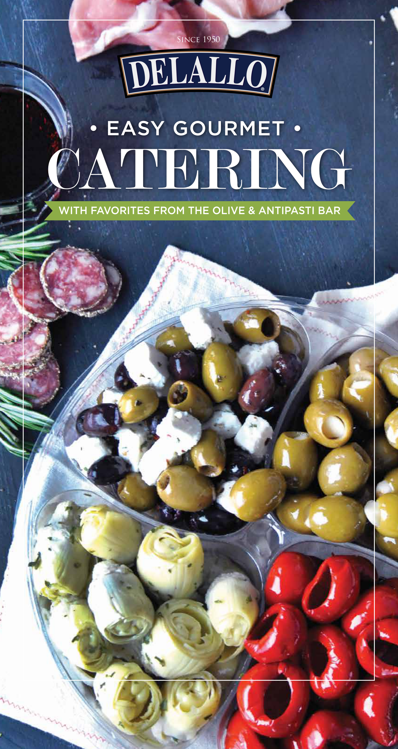
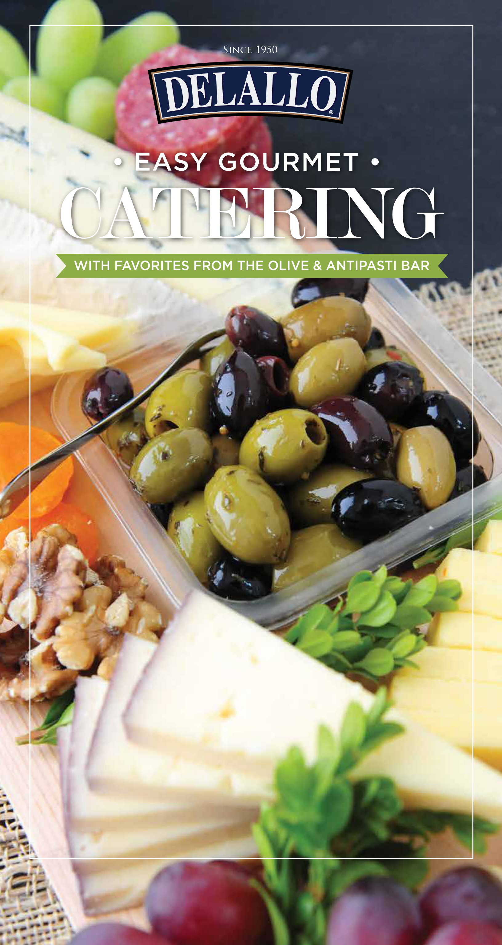
A 20-page guide to specialty platters and prepared foods. Generous food photography, category cues, and clear menu details help customers explore options for gatherings of every kind.

Portrait format · Catering & prepared foods
Original DeLallo Effortless Entertaining cover beside an open catering brochure showing specialty platter options on a light stone tabletop
Cover & open spread · Pages 6–7

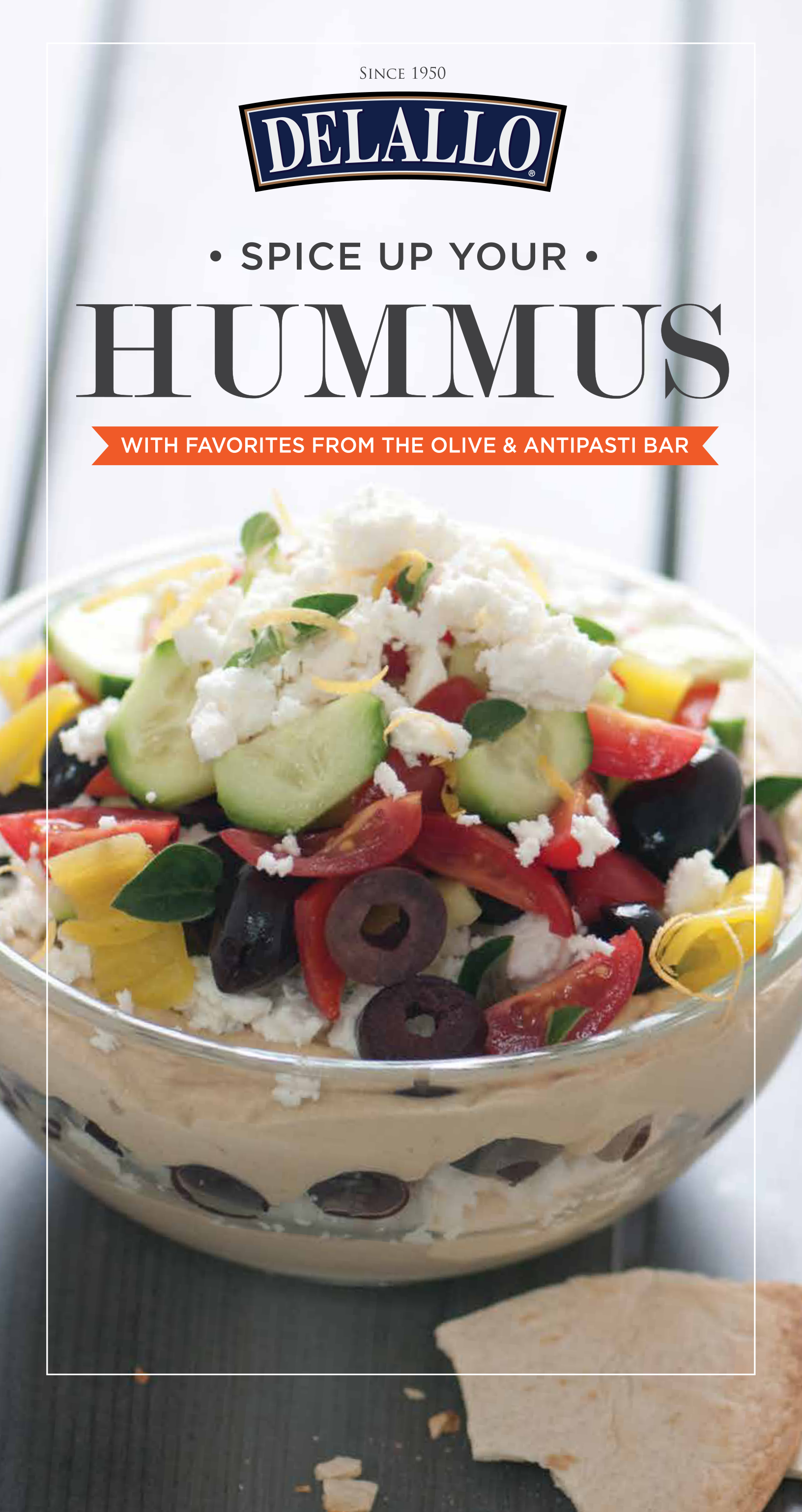
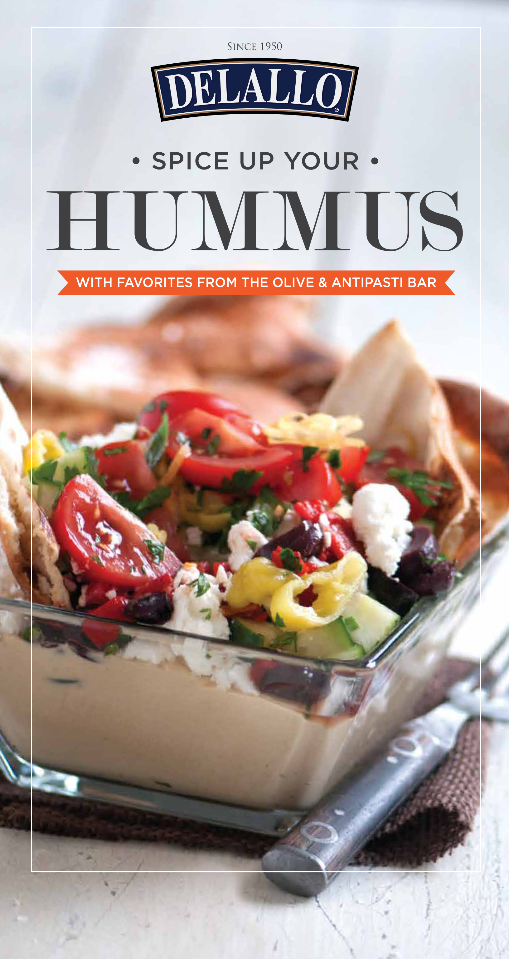
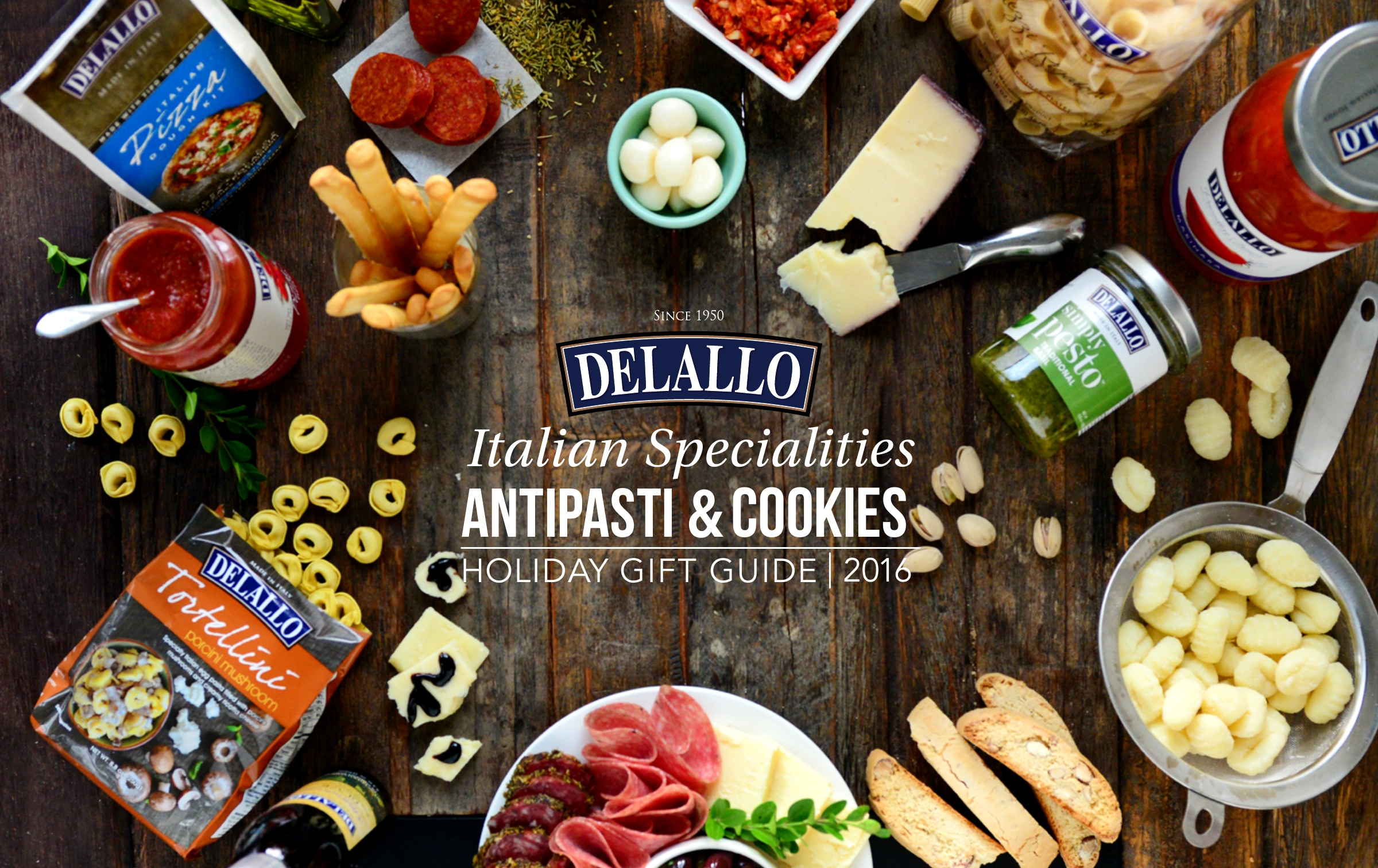
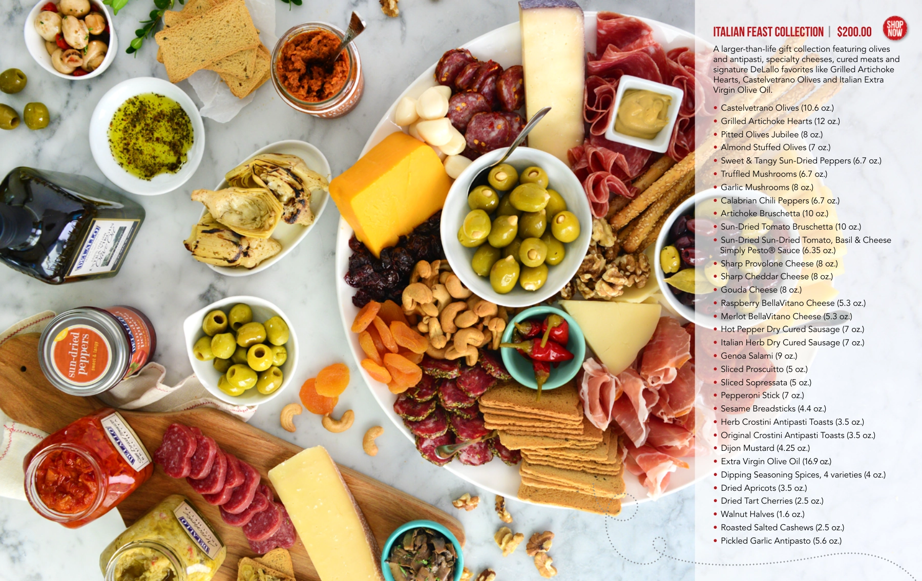
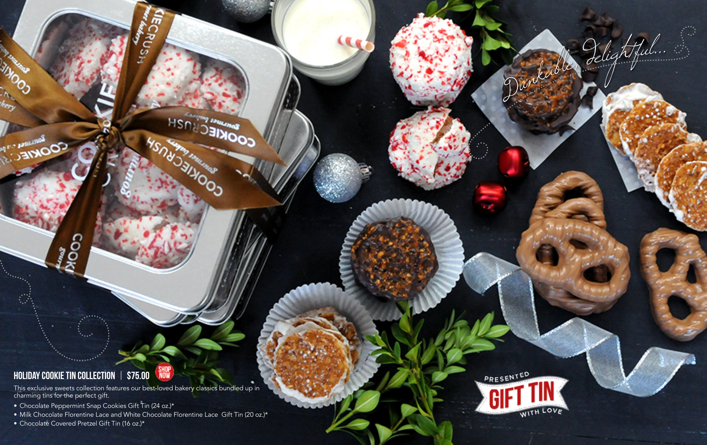
02 · Holiday gift catalog

The best of Italian gift giving.

A 16-page gift guide featuring Italian specialties, antipasti collections, cookies, and curated assortments. Rich tabletop photography brings the gifts together, while product descriptions and pricing make the range easy to explore.

Landscape format · Holiday gifts & assortments
Cover and selected page examples from the 16-page catalog.

01 · Challenge

Give two different shopping occasions a clear, appetizing point of entry: choosing prepared foods for a gathering and finding Italian specialty gifts for the holidays. Each catalog needed its own personality while feeling connected to DeLallo.

02 · Solution

Built each publication around food photography, clear typographic hierarchy, and layouts tailored to its assortment. The catering brochure balances generous food images with practical menu information; the holiday guide pairs richly styled product photography with gift descriptions and pricing.

03 · Outcome

Two complementary publications that organize the DeLallo assortment around the occasion. One makes catering options approachable; the other brings Italian gift giving to life through curated collections and seasonal inspiration.

Contribution

Catalog designCover and spread designTypography and layoutProduct presentationProject management
Back to selected work ↑

Case study · 06

DeLallo

A fresh look for a familiar favorite.

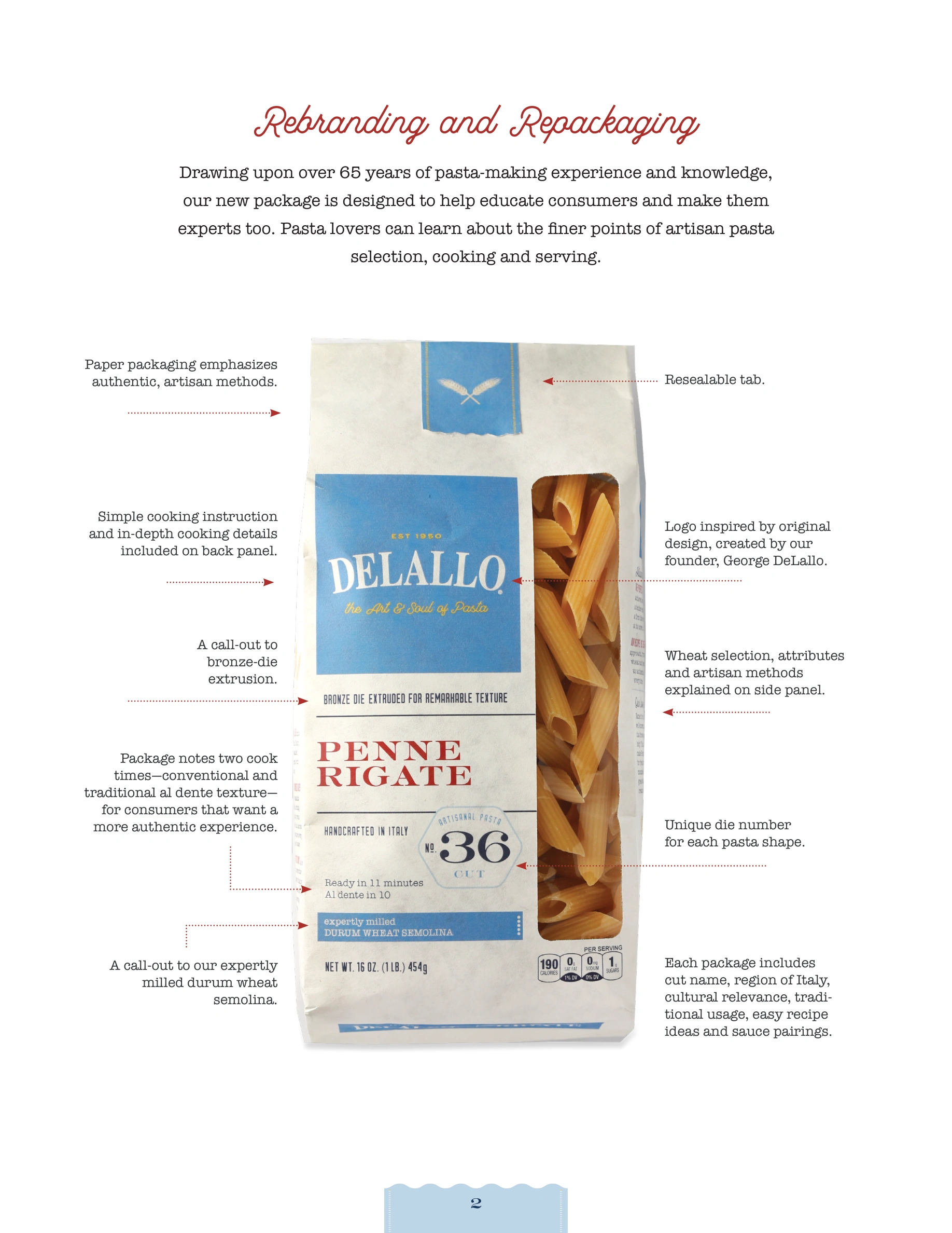
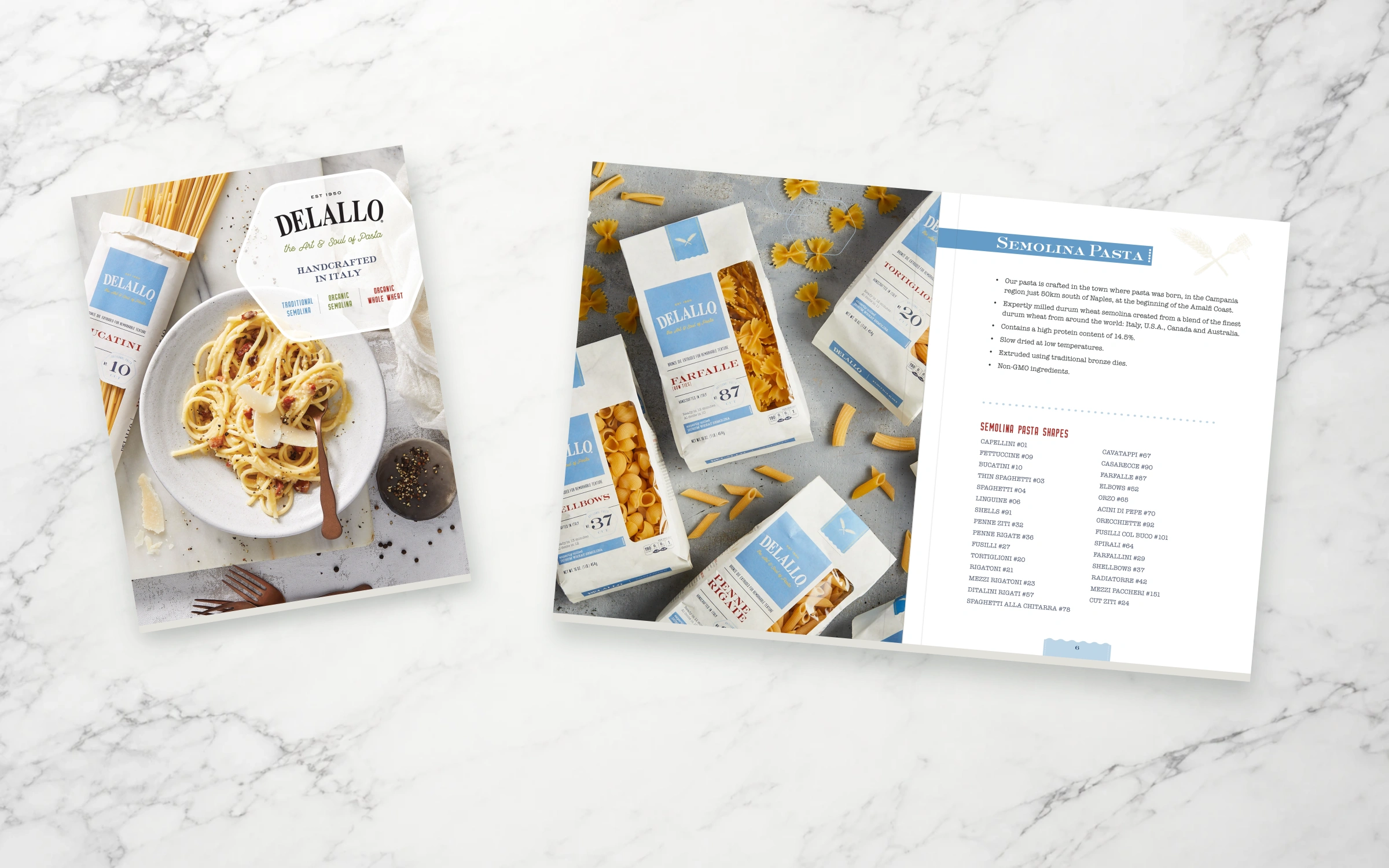
A sales brochure supporting the launch of DeLallo’s refreshed pasta packaging—bringing new energy to an established product line while keeping its Italian heritage and quality at the heart of the story.

Sales EnablementBrochure DesignPackaging Launch
Original DeLallo pasta launch brochure cover beside an open Semolina Pasta spread, laid at complementary angles on light marble

01 · Challenge

Help the sales team introduce a new look for a valued, established pasta line. The brochure needed to explain the packaging refresh, highlight the product’s quality, and make the assortment easy to present.

02 · Solution

Designed the brochure from cover to final page, pairing product photography with clear layouts, the story behind the pasta, and practical assortment details. I also worked on the pasta packaging for the new-look launch, connecting the product on the shelf with the story in the sales team’s hands.

03 · Outcome

A coordinated launch brochure that gives the sales team a clear, engaging way to introduce the refreshed line, explain what changed, and bring renewed attention to a familiar DeLallo favorite.

Contribution

Brochure concept and designCover and editorial layoutPasta packaging designProduct and launch storytellingSales enablement materialsProject management
Back to selected work ↑

Case study · 07

DeLallo

Small jars. A clear family resemblance.

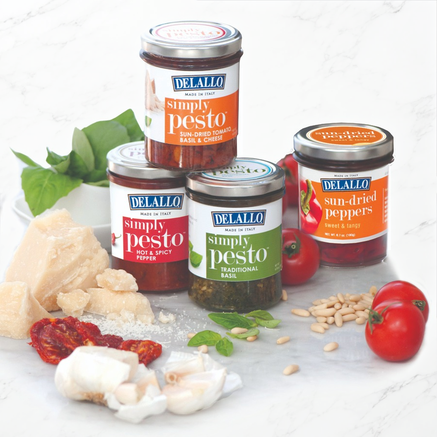
Packaging and label design for DeLallo’s Simply Pesto varieties and complementary specialty items, carried from concept through completion with domestic and international vendors.

Packaging & Label DesignVendor ManagementFDA Label Requirements
Original DeLallo Simply Pesto and sun-dried pepper jars with fresh ingredients on a completed light marble background

01 · Challenge

Give each variety a distinct identity while keeping the collection clearly connected to DeLallo. Each label needed to balance brand presence, flavor recognition, and required product information within a compact jar format.

02 · Solution

Created the layout and design of each item, using a shared hierarchy, clear product naming, and flavor-specific colors to connect the family. I guided the work from concept through completion, coordinating domestic and international vendors and ensuring FDA label requirements were met.

03 · Outcome

A cohesive packaging family that makes the varieties easy to recognize and brings a consistent DeLallo presence to the shelf, supported by coordinated vendor execution and attention to label requirements.

Contribution

Packaging concept and designLabel layout and typographyFlavor and variety navigationDomestic & international vendor managementFDA label requirementsProject management
Back to selected work ↑

Case study · 08

Point Park University

Turning alumni stories into an editorial experience with lasting institutional pride.

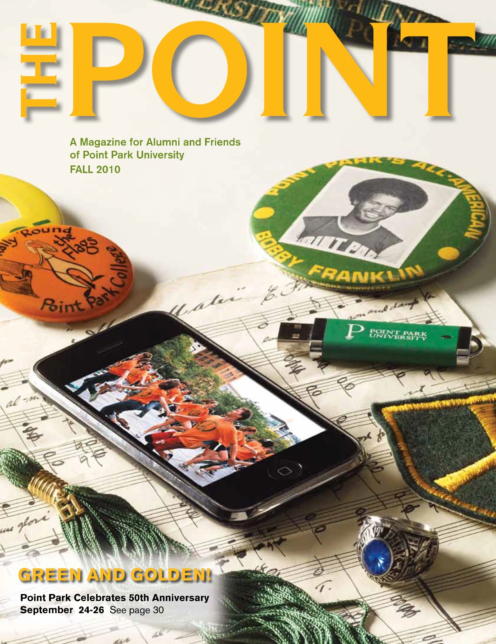
The Point was Point Park University’s quarterly magazine for alumni and friends—keeping its community informed about university news, alumni updates, campus events, and all things Point Park through one cohesive editorial experience.

Editorial DesignPhoto & Art DirectionPrint Production
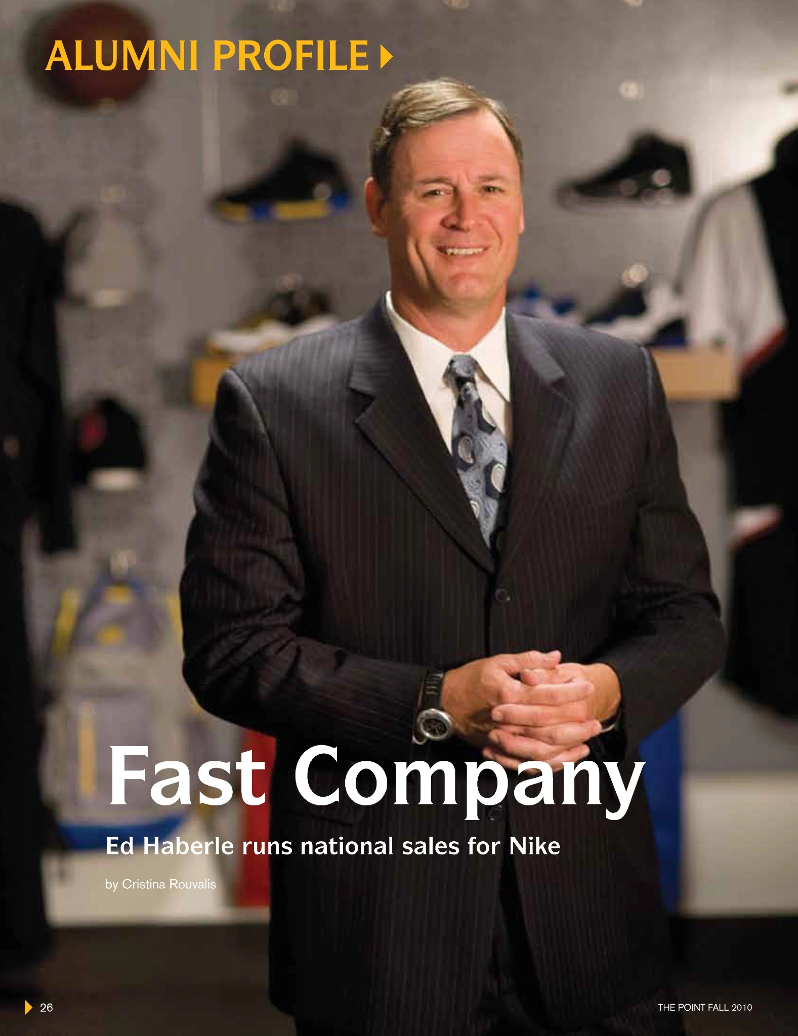
The Point alumni magazine Fall 2010 cover
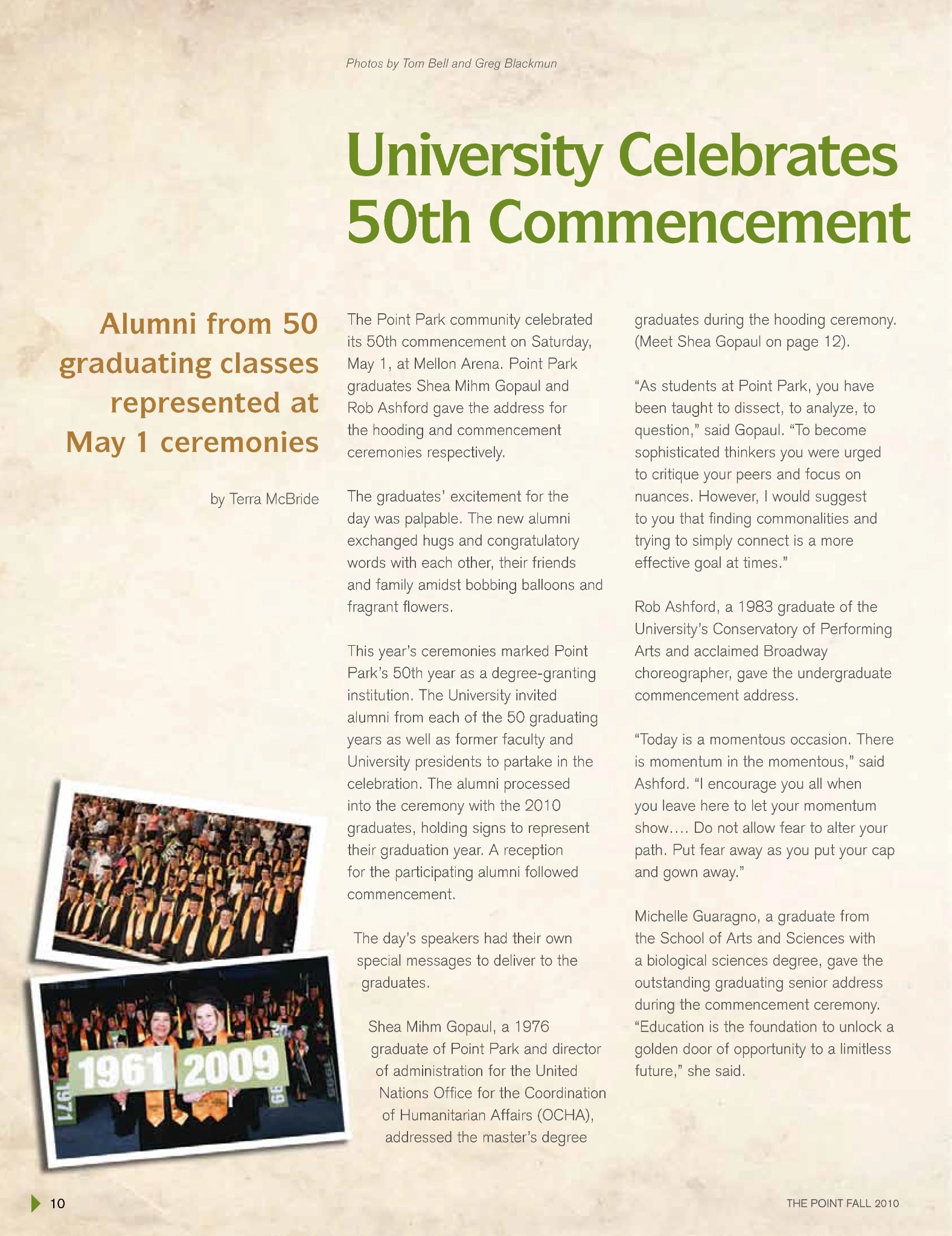
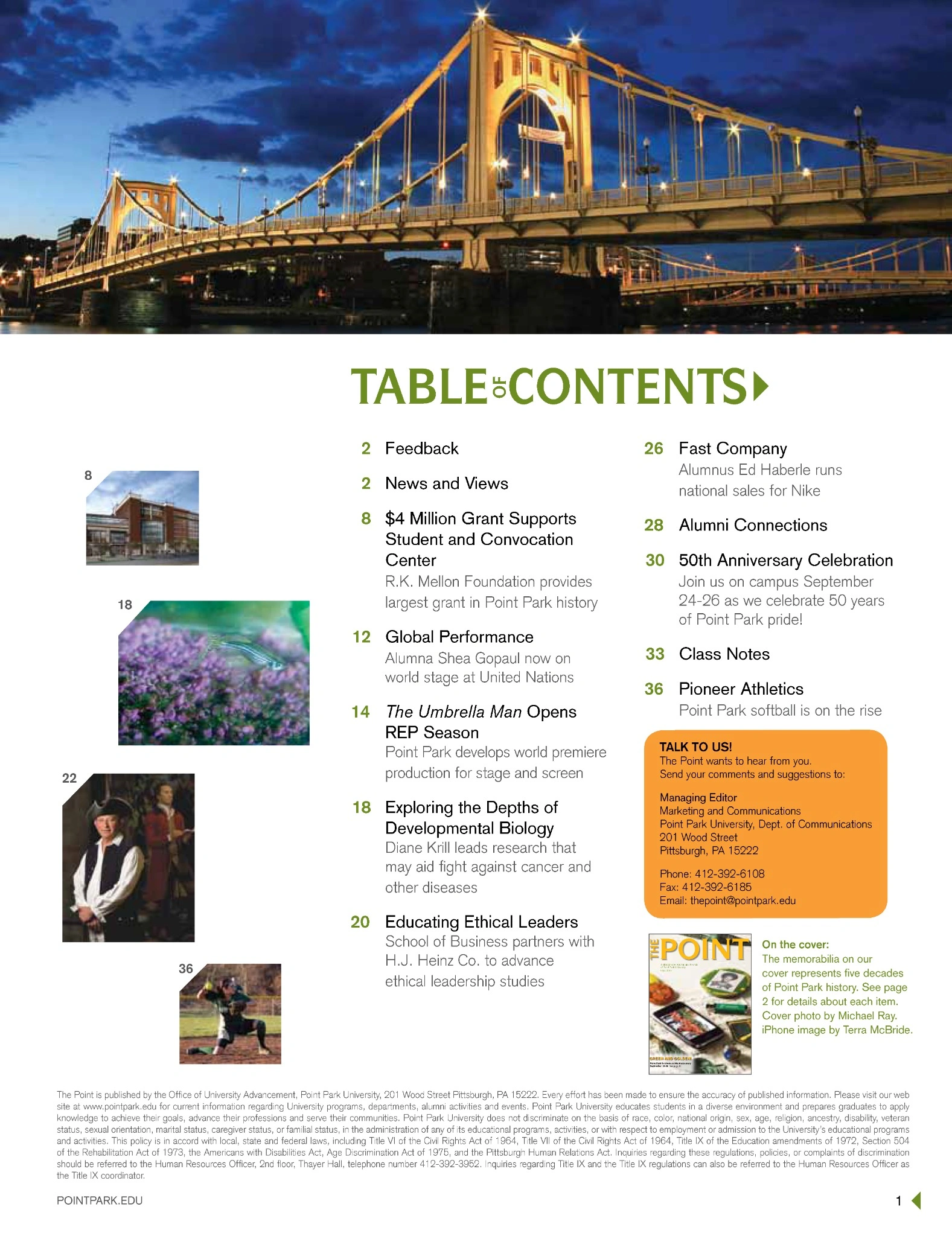
University Celebrates 50th Commencement feature page
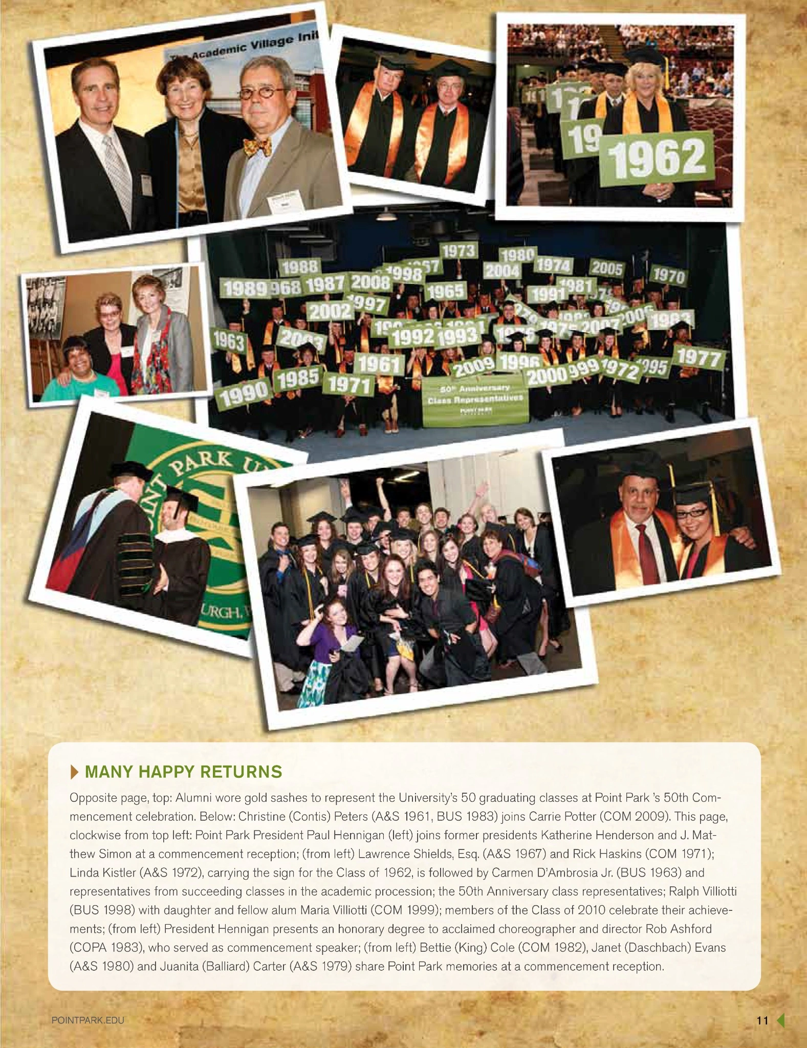
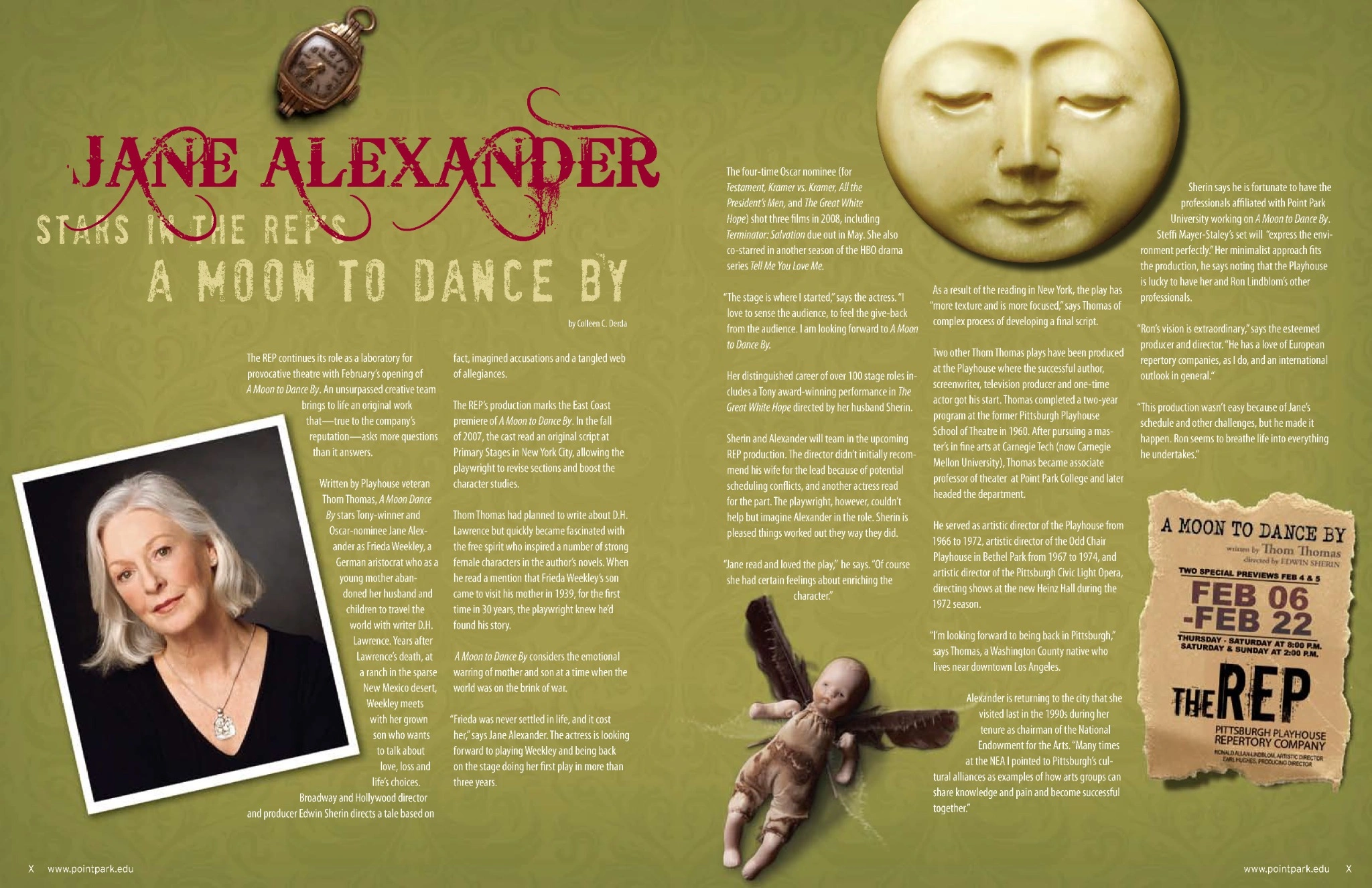
50th Commencement feature photo collage page
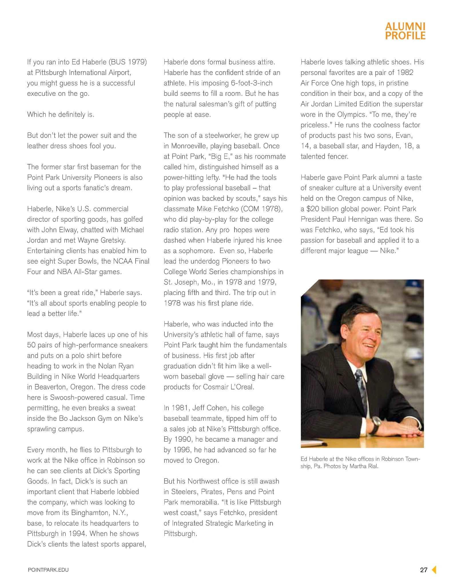
Fast Company alumni profile opening page

01 · Challenge

Shape each quarterly issue’s wide-ranging mix of university news, alumni updates, campus events, milestones, and feature stories into a publication that felt unified, engaging, and unmistakably Point Park.

02 · Solution

Designed the magazine’s cover and editorial system with flexible typography, strong opening pages, paced feature spreads, and photo-led storytelling. Directed photography and artwork to give each story its own voice while maintaining continuity across the issue.

03 · Outcome

A polished quarterly publication that kept alumni connected to the university while moving confidently between timely campus information and feature storytelling—giving Point Park a distinctive editorial voice and celebrating its people, history, and creative community.

Contribution

Magazine and cover designEditorial hierarchy and typographyPhoto and art directionPress checksProofing and print productionProject management
Back to selected work ↑

About Christie

Strategic thinking.
Creative instinct.
Production rigor.

For more than two decades, I’ve helped brands turn ideas into experiences people can understand, trust, and choose. My background spans packaging, retail marketing, visual storytelling, and content strategy—giving me a rare ability to connect the big idea to the smallest production detail.

I’m equally comfortable shaping a narrative, building a visual system, presenting to stakeholders, and making sure the final work is accurate, accessible, and ready to perform.

View résumé (PDF) ↗
01Brand & packaging02Content strategy03Creative direction04Pitch storytelling05Retail marketing06Art direction07Print production08Cross-functional leadership